Get Inspired
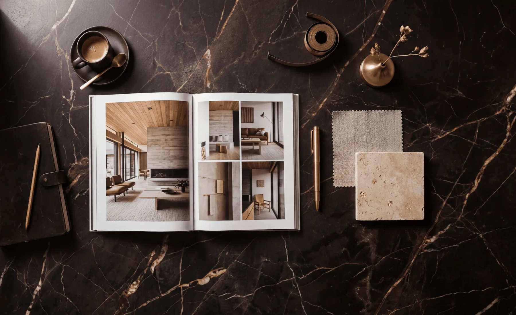
Kitchens built to last decades. Interiors designed around how people actually live. Every room in this portfolio is a private residence in Alberta — and every one of them unmistakably Carl.

“The difference between a decorator and a designer is the difference between selecting finishes and rethinking the space itself.”
Carl Langeveldt is the kind of designer who makes clients feel, within minutes, that their home can become more than they first imagined. He grew up in South Africa, where his eye for beauty, proportion, and atmosphere developed early, and later spent formative years in London, immersed in one of the world's great design capitals. In June 2016, he purchased Interiors On Main from Judy McLean and stepped into its next chapter on Main Street in historic downtown Camrose. The decade since has defined his work in Central Alberta.
What sets Carl apart is that he does not approach a house as a decorator working on the surface. He approaches it as a designer. He takes architectural drawings or existing floor plans and redraws them, studying layout, light, traffic flow, storage, and proportion before a finish is ever chosen. Kitchens and cabinetry remain a signature part of his practice, but the studio moves comfortably through full-space planning, furniture selection, tile coordination, window fashions, custom art, and the quieter design decisions that make a room feel complete rather than simply furnished.
Clients who step into Interiors On Main are stepping into a full-service studio with access to trusted Canadian suppliers, dealer-exclusive lines, and a designer whose work has been featured in magazines and shaped by international experience. Very few designers in Central Alberta can make those claims with substance behind them. Carl brings a point of view formed well beyond this region, then translates it into homes that feel personal, livable, and deeply considered from the first sketch to the final selection.
The pages that follow are the proof. Ahead is a portfolio of kitchens, custom millwork, full interiors, and finished rooms already delivered for real clients. Some are bold and architectural. Some are quiet and deeply resolved. All of them show the same through-line: Carl's ability to take possibility, refine it with discipline, and turn it into spaces that feel elevated, intentional, and meant to be lived in.
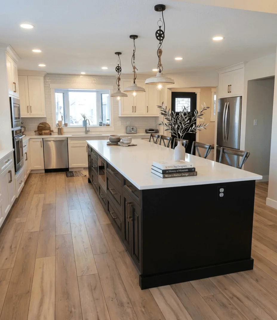
“What looks generous is actually very tightly controlled.”
The island establishes the room before the pendants do. Its dark base gives the kitchen weight, while the pale perimeter and long floorboards keep the eye moving cleanly to the sink wall.
Study the length of the counter, but also the discipline beneath it. Repeated drawer fronts, modest hardware, and uninterrupted walking space are what let a kitchen of this scale feel calm rather than oversized.
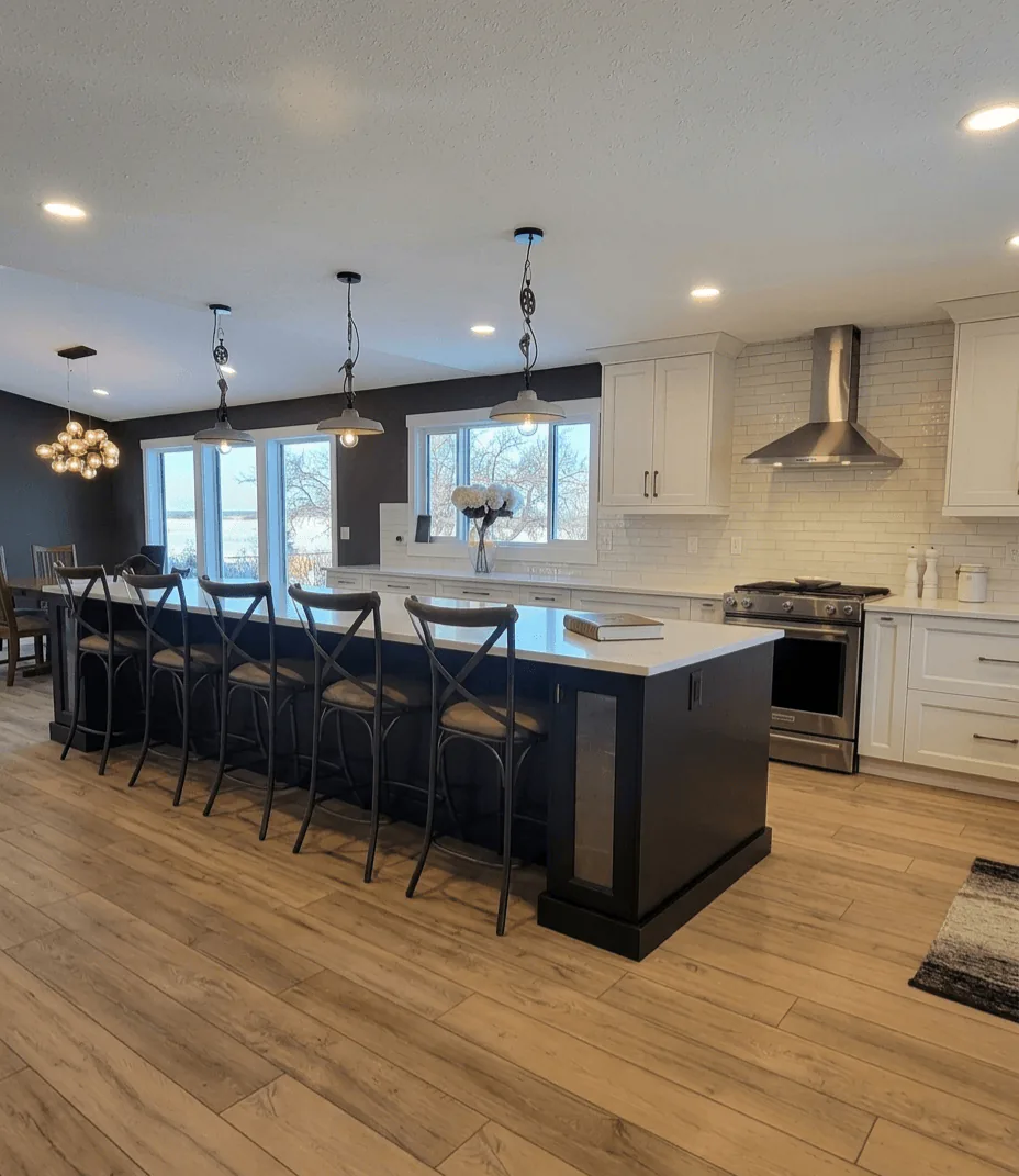
“From this angle the kitchen stops being a workspace and becomes the social centre of the floor.”
The row of stools changes the reading of the island immediately. What could have been a purely functional block becomes a place to linger, with the dining zone and windows extending the room well past the cooktop.
It is worth noticing how seating has been handled. There is enough overhang to be comfortable, but the aisle still stays generous, which is exactly the kind of quiet planning that makes a kitchen feel easy every day.
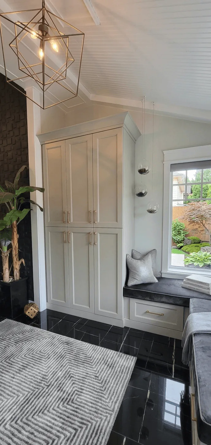
“A first impression can be quiet and still unmistakably designed.”
This is not a decorative entry. It is a working threshold shaped into something composed: tall storage, a built-in seat, and black floor tile that gives the pale cabinetry something firm to land on.
The detail to notice is the way the cabinet crown follows the pitched line beside it. Small alignments like that are what make millwork feel native to a home rather than installed into it.
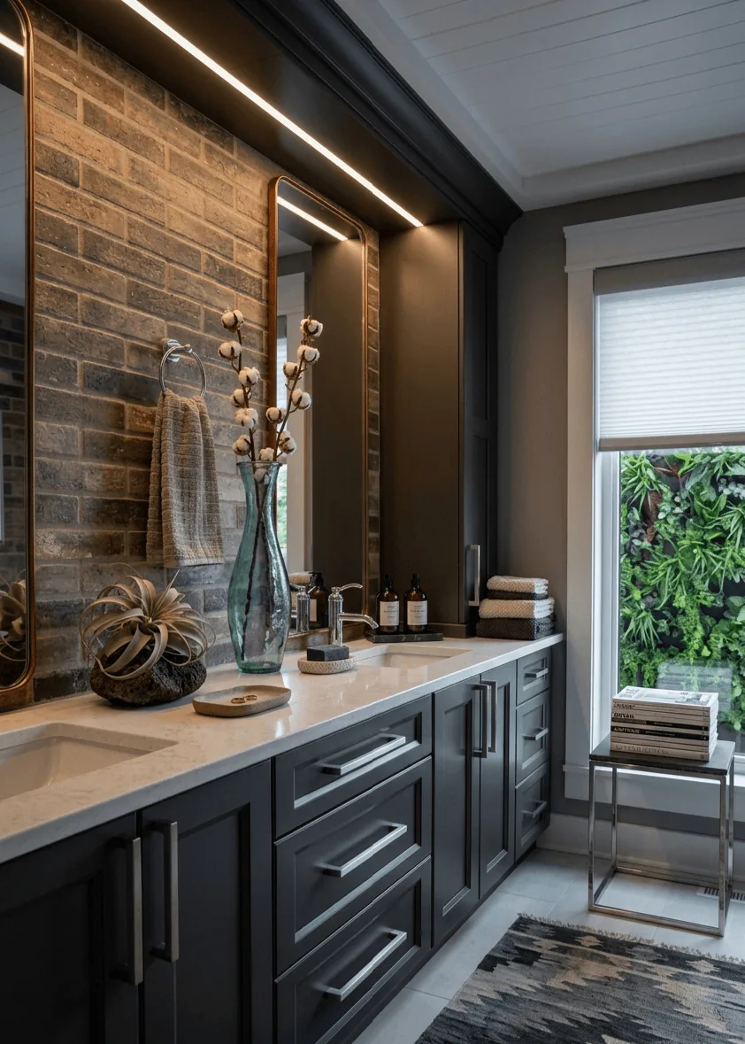
“The room gets its atmosphere from material depth, not from excess.”
A long vanity wall, paired mirrors, and textured brick give this bathroom its identity immediately. The darker cabinetry grounds the room, while the pale counter and window trim keep the palette from closing in.
Look closely at the light strategy. The linear wash at the ceiling edge softens the dark millwork, and the daylight at the end of the run keeps the composition breathable. In a bathroom, that balance is often the difference between dramatic and oppressive.
“Small rooms reward the designer who knows where to spend space.”
This suite kitchen is compact, but the layout refuses to feel compromised. The island becomes prep space, dining edge, and visual divider at once, while the oak cabinetry keeps the room warm enough to read as a stay, not a utility zone.
Pay attention to the window wall and the service opening in the background. When secondary functions are tucked cleanly into the plan, the main room can remain open and composed.
“Efficiency is convincing only when it still feels relaxed.”
From this angle, the room reads as a very controlled galley. The island, range wall, and refrigerator line sit in direct conversation, which shortens every movement without making the plan feel tight.
What a homeowner might notice here is the amount of clear counter kept around the work zones. Good kitchens are not only about what gets added. They are about what is left open on purpose.
“The emptier view often tells the truth about the design.”
Stripped of styling, this room still feels complete. The scale of the window, the soft drapery, and the pale floor do most of the work, proving that the architecture and window treatment were carrying the atmosphere all along.
It is a useful lesson when planning a space of your own. If a room looks resolved before the furniture arrives, the underlying decisions are probably right.
“Privacy should arrive without flattening the day.”
Here the eye goes straight to the shade, which is exactly the point. The layered banding tempers glare and privacy in the same move, yet it still lets the room keep its daylight and view.
For anyone studying their own windows, notice the proportion of the casing and the way the treatment sits within it. Clean trim and an appropriately scaled shade make the control look architectural instead of added late.
“A compact bathroom can take a firmer point of view.”
This is where the suite stops being merely practical and becomes memorable. Dark tile, a warm vanity, and a faceted mirror give the room shape, while the lighter floor keeps the weight off the ground.
The shower enclosure deserves a close look. Framing the darker tile in glass lets the stronger material stay visible, which makes the bathroom feel larger than if everything had been diluted.
“A full-home project is often felt first as sequence.”
This corridor sets the temperament of the house before a single feature room is fully seen. Oak floorboards pull the eye forward, while the lit recesses interrupt the length just enough to make the walk feel intentional.
That is a designer kind of control. When circulation has rhythm, the rooms beyond arrive with more presence because they have been introduced, not simply exposed.
“Comfort becomes sharper when the wall behind it has structure.”
The fireplace wall is handled like composed millwork rather than a television problem. White framing, dark inserts, and the low ribbon of fire give the room definition without dragging the whole palette darker.
Notice how the chairs sit slightly proud of the rug and glass table. In living rooms, spacing is as important as upholstery. The room feels open because the furniture has been given room to breathe.
“Some of the most persuasive design happens between the major rooms.”
A slim console, large reflections, and one abundant arrangement turn a circulation moment into an event. It is a soft move, but it makes the transition between rooms feel curated rather than accidental.
Homeowners often underestimate these in-between spaces. They are where sightlines stack, and where a house starts to feel finished instead of simply complete.
“When art is given architecture, the wall changes status.”
This niche does more than display a piece. It frames it, lights it, and gives it enough margin to hold the wall on its own, which is why the whole hall feels quieter and more assured.
It is worth noticing the restraint around it. No competing trim, no extra objects, just a clear recess and a measured light source. That simplicity is what makes the gesture look expensive.
“Reflection can enlarge a room without making it louder.”
Seen from this corner, the mirrored paneling becomes a tool rather than decoration. It lengthens the room, returns light into the seating area, and gives the plant and lamp a deeper backdrop than paint alone could provide.
The lesson here is proportion. Large reflective surfaces work best when the rest of the vignette is grounded, and the low side table and substantial sofa do exactly that.
“A work room can feel distinct without cutting itself off from the house.”
Through the glazed doors, the office reads as part of the larger composition. The walnut desk, sculptural chair, and soft rug keep it professional, but never cold.
The doors are the detail to study. Transparency lets the room borrow light and connection, while the frame still gives it definition. That balance is especially useful in homes that need focus without isolation.
“Long walls are an opportunity if they are given cadence.”
This perspective shows how the hall has been broken into moments. Artwork sits in deep reveals, light is tucked rather than announced, and the floor line carries everything forward.
Many corridors are treated as leftover space. Here, the passage itself becomes part of the design story, which is why moving through the house feels considered rather than purely functional.
“Open plan succeeds when each zone still knows its role.”
From the living room, the darker kitchen reads as a defined destination rather than background. The sofa, ottomans, and patterned rug keep the seating area grounded, so the transition into the kitchen feels clear.
This is a useful thing to notice in open homes: contrast can separate rooms more gracefully than walls. When materials shift with intention, the plan stays open without losing order.
“The room is generous, but the order inside it is what persuades.”
The island is doing more than offering storage. It establishes the axis of the whole kitchen, with the chandelier, shelves, and range wall all reading against it.
Look closely at the drawer rhythm and the amount of landing space around the perimeter. Those are the decisions that make a kitchen easy to live in long after the first impression of walnut and stone has passed.
“Close views tell you whether the discipline is real.”
At this distance, the cabinetry has nowhere to hide. Grain direction, handle scale, and the spacing of the drawer fronts all have to hold together, and here they do.
This is the sort of detail a homeowner should study before finalising millwork. A large pull can either overpower a cabinet or give it architecture. In this case, the proportion is what makes the island feel custom.
“A light palette has to be precise to avoid disappearing.”
This kitchen relies on nuance rather than contrast. Pale oak, soft stone, and black-framed glass create a room with very little visual noise, which makes the craftsmanship easier to read.
The cabinet and display pairing is worth noticing. One side hides volume, the other reveals it. That balance between closed storage and visible order is often what keeps a minimalist kitchen from feeling sterile.
“A single framed cabinet can change the whole register of a wall.”
Here the eye lands on the glass-front cabinet and the narrow window beside it. Together they create a pause in the run of oak, bringing lightness to what could have been an entirely solid wall.
The detail to study is the black frame. It adds structure without adding weight, which is a useful strategy when a room needs definition but not more mass.
“Sometimes one wall carries the whole argument of the room.”
This elevation shows how much calm can be built from very few gestures. A pared-back hood, two sconces, and a long stone field give the wall quiet authority.
Notice how the upper cabinet stops short of symmetry by just enough to feel considered rather than rigid. That is often where refinement lives, in the slight adjustment that keeps a room human.
“Contrast feels mature when every note is kept under control.”
The olive wall, white cabinetry, walnut island, and black accents could easily have fought one another. Instead, they read as a measured composition because no one element is trying to dominate the rest.
Homeowners studying their own kitchens should notice the shelf styling and the restrained hardware. When the permanent elements are clear and simple, personality can come through without turning the room into a theme.
“The supporting wall is often where a kitchen proves itself.”
This service zone is handled with the same seriousness as the main cooking wall. Open shelves, glass uppers, beverage storage, and a prep sink turn the everyday rituals into part of the design, not an afterthought.
The useful detail is the mix of open and closed storage. A room stays calm when frequently used objects are easy to reach, but not everything is asked to perform visually.
“Overhead light changes the logic of the room.”
The skylight does more than brighten the kitchen. It lifts the darker island and black backsplash out of heaviness, allowing the deeper finishes to feel crisp rather than dense.
It is a smart lesson in sequencing. When natural light is doing the major work, the rest of the palette can afford more contrast without losing ease.
“A long island has to serve the room from more than one side.”
From this end, the island reads as a shared table as much as a work surface. Seating, prep zone, and the view toward the dining area are all held in one long gesture under the skylight.
Notice how much clear circulation remains around it. Scale only feels luxurious when movement stays easy, especially in a kitchen built to host.
“Large storage walls need quiet detailing more than they need drama.”
This corner proves how much cabinetry can be present without taking over the room. The tall refrigerator wall, warm grey paint, and black counters are all substantial, but the panel profiles and brass hardware keep the mass elegant.
For anyone planning a larger kitchen, this is the detail to study. Tall storage feels intentional when it reads as one composed wall, not as a collection of individual boxes.
“Back-of-house spaces feel better when they speak the same language as the kitchen.”
The laundry continues the kitchen palette rather than abandoning it. Full-height cabinetry, stacked machines, and a direct exterior door make the room highly practical, but the measured detailing keeps it from feeling like a downgrade.
That continuity matters more than people expect. When service spaces carry the same level of design intelligence, the entire house feels more coherent.
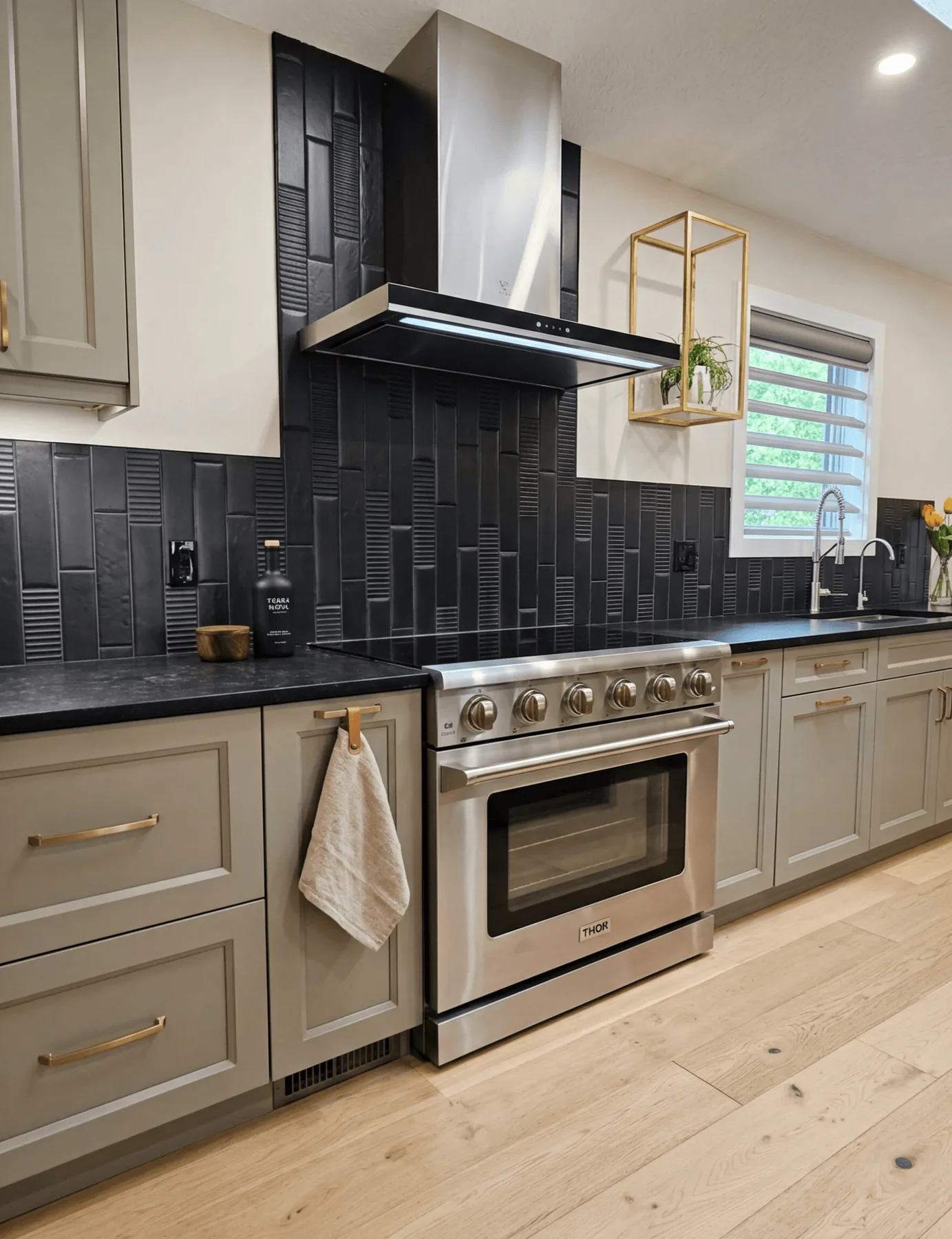
“A focal wall can be bold without breaking the room.”
This is the sharpest view of the black tile and metal hood, and it shows why the choice works. The textured vertical tile gives the wall depth, while the pale cabinetry and wood floor stop it from reading harsh.
The small gold accent by the window is easy to miss, but that kind of note is often what makes a composition feel finished. A room remembers restraint more than novelty.
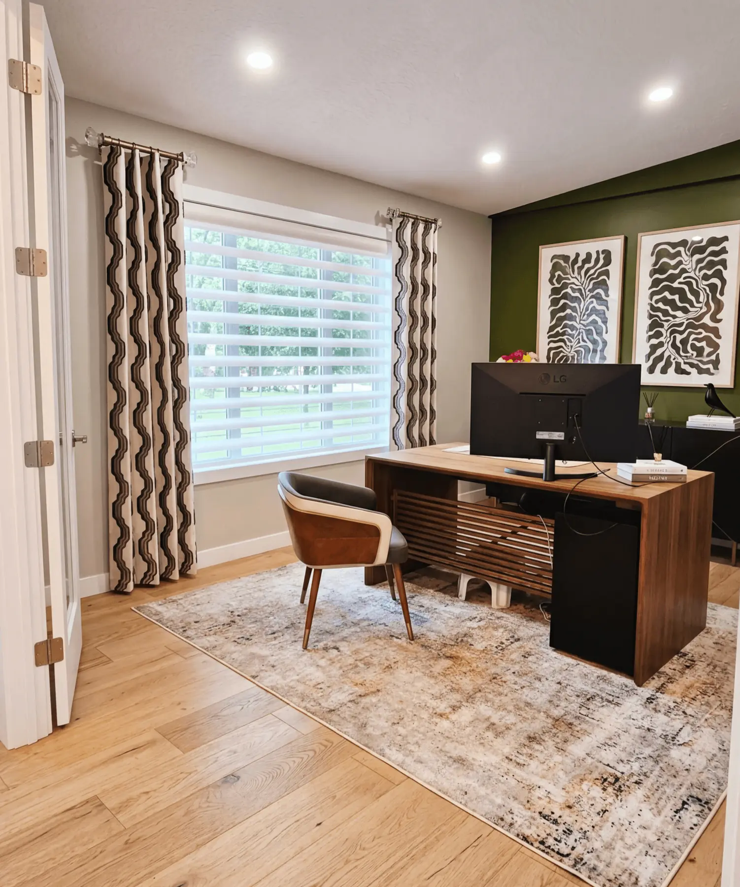
“A work room should support concentration before it starts talking about style.”
The view is structured around three things: the desk, the large window, and the dark green wall that gives the back of the room its depth. The patterned drapery adds movement, but the palette stays controlled enough to keep the eye settled.
A homeowner studying this room should pay attention to glare management. The blinds do the practical work, while the side panels give the window presence. That combination is what makes an office feel finished rather than furnished.
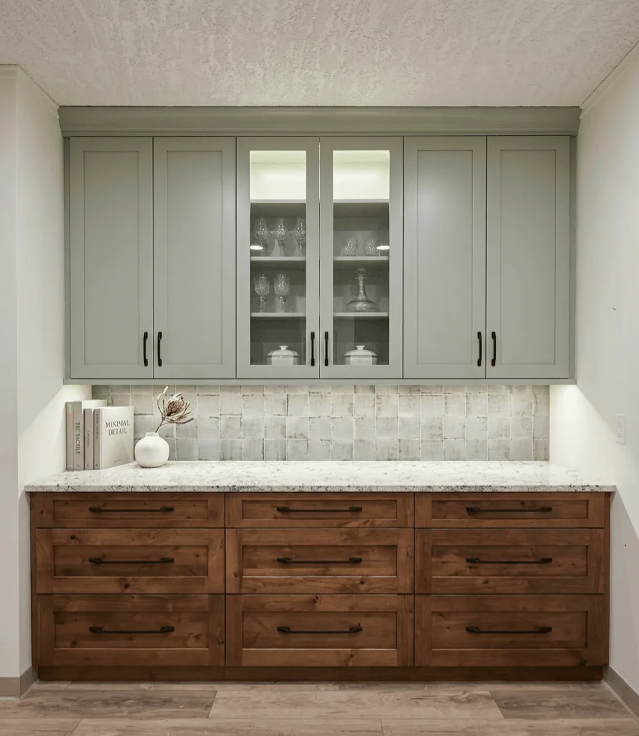
“Colour feels most expensive when it is contained by strong joinery.”
The sage upper cabinets introduce personality, but the room gets its seriousness from the walnut below and the lit display cabinet at centre. Nothing is loud, yet the composition is unmistakably deliberate.
The detail worth borrowing is the contrast in transparency. Most of the storage stays solid and calm, while the glazed section invites a curated layer. That small shift keeps the wall from feeling flat.
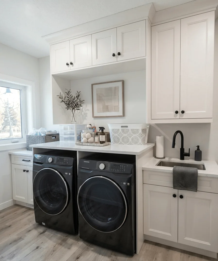
“Even the workrooms can carry a sense of finish.”
This laundry is resolved the way many kitchens wish they were. Upper cabinets clear the clutter, the counter stretches uninterrupted across the machines, and the sink is given enough room to function without looking squeezed in.
The lesson here is in proportion. Tall storage, overhead storage, and open counter have all been balanced so the room still feels bright. Utility does not have to come at the cost of ease.
“Height is beautiful, but it still needs something to hold it.”
With the railing and upper level overhead, this kitchen could easily have felt all volume and no centre. The dark island fixes that immediately, giving the room a grounded middle against the pale cabinetry and white tile.
The detail to notice is how the island colour is repeated sparingly in the appliances and hardware. Repetition is what makes contrast feel intentional instead of abrupt.
“A compact workspace can feel complete if it is given real edges.”
This office is a niche, not a spare room, and that is precisely what makes its clarity impressive. The sliding barn door establishes a threshold, while the built-in desk turns the recess into purpose rather than leftover square footage.
Look at the depth of the worktop and the placement of the drawers. Small work areas succeed when every inch has a role, especially when the room still needs to feel open beyond the task at hand.
“The best custom seating solves the room before it styles it.”
This built-in bench does more than create a comfortable place to sit. It turns an awkward corner into an anchored dining zone, with wood base panels that give the upholstery a sense of permanence.
There is a practical detail here worth keeping in mind. The seating depth stays generous without crowding the kitchen behind it, which is exactly the sort of measurement choice that determines whether custom work truly improves daily life.
“A restrained bathroom can still feel richly considered.”
This vanity wall relies on proportion more than ornament. The tall mirror surround gives the room height, the dark counter adds weight, and the gold hardware keeps the grey cabinetry from going flat.
The smartest move may be the lighting tucked into the bridge above the mirror. In smaller bathrooms, light placed within millwork can do the work of extra decoration without adding clutter.
“A small room is often where the boldest idea belongs.”
This powder room commits fully to mood. The mural pulls the eye to the far wall, the black surround closes the room in, and the walnut vanity adds warmth so the drama never turns cold.
The detail to notice is the restraint around the sink wall. The vanity stays clean and linear, which gives the artwork room to carry the emotion. In compact rooms, one strong gesture is usually more powerful than many.
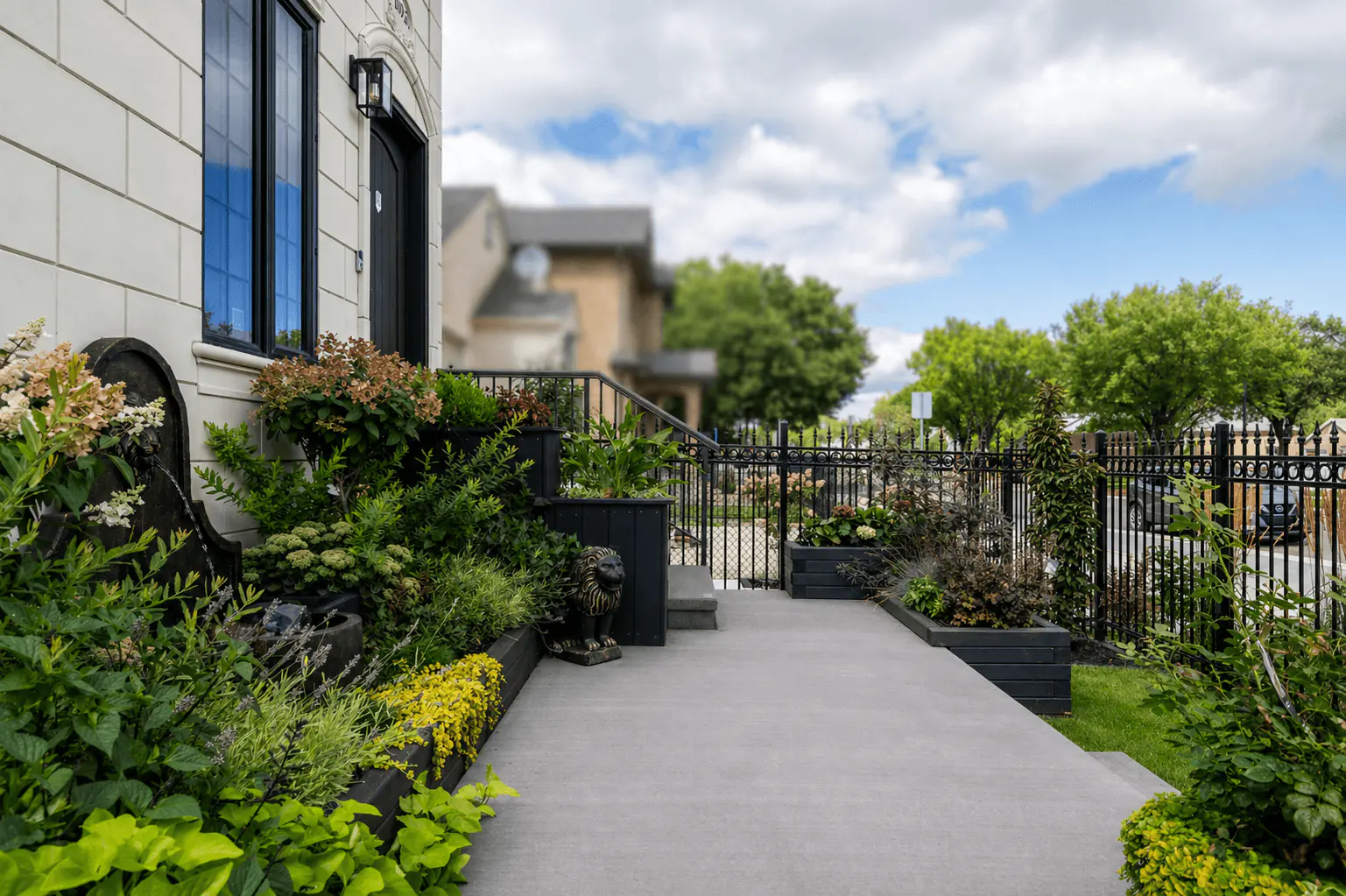
“Water and planting give the frontage its first pause.”
The fountain and raised black planters now carry the first read of the frontage. Water, foliage, and softened edges make the compact entry feel like a garden room before the eye moves toward the steps.
The concrete still keeps movement clear, but it is supporting the composition rather than becoming the story. Planting spills over the planters, the fence filters the street, and the water feature gives the approach a calmer centre of gravity.
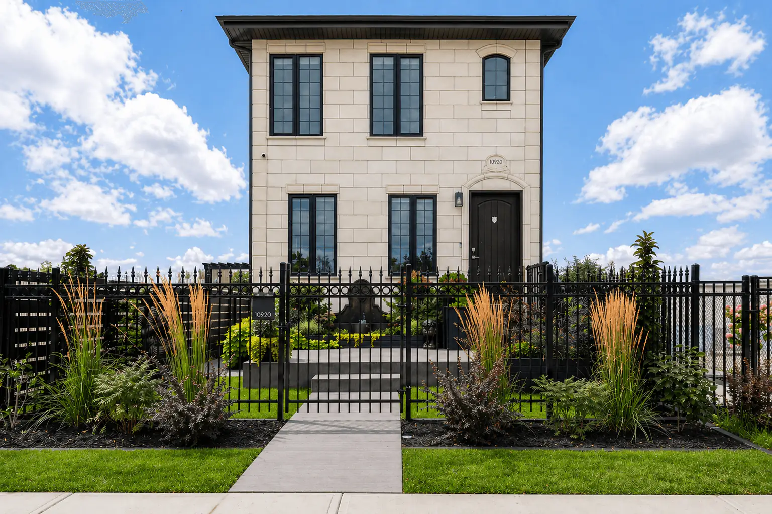
“The fence line and planting give the architecture a sharper public face.”
From the curb, IOM arranged the frontage with a centred walk, black fencing, and planting beds that sit low enough to frame the house instead of hiding it.
Grasses and layered foliage soften the stone facade while preserving clear sightlines. The result is stronger curb appeal with privacy built into the edge, not added as an afterthought.
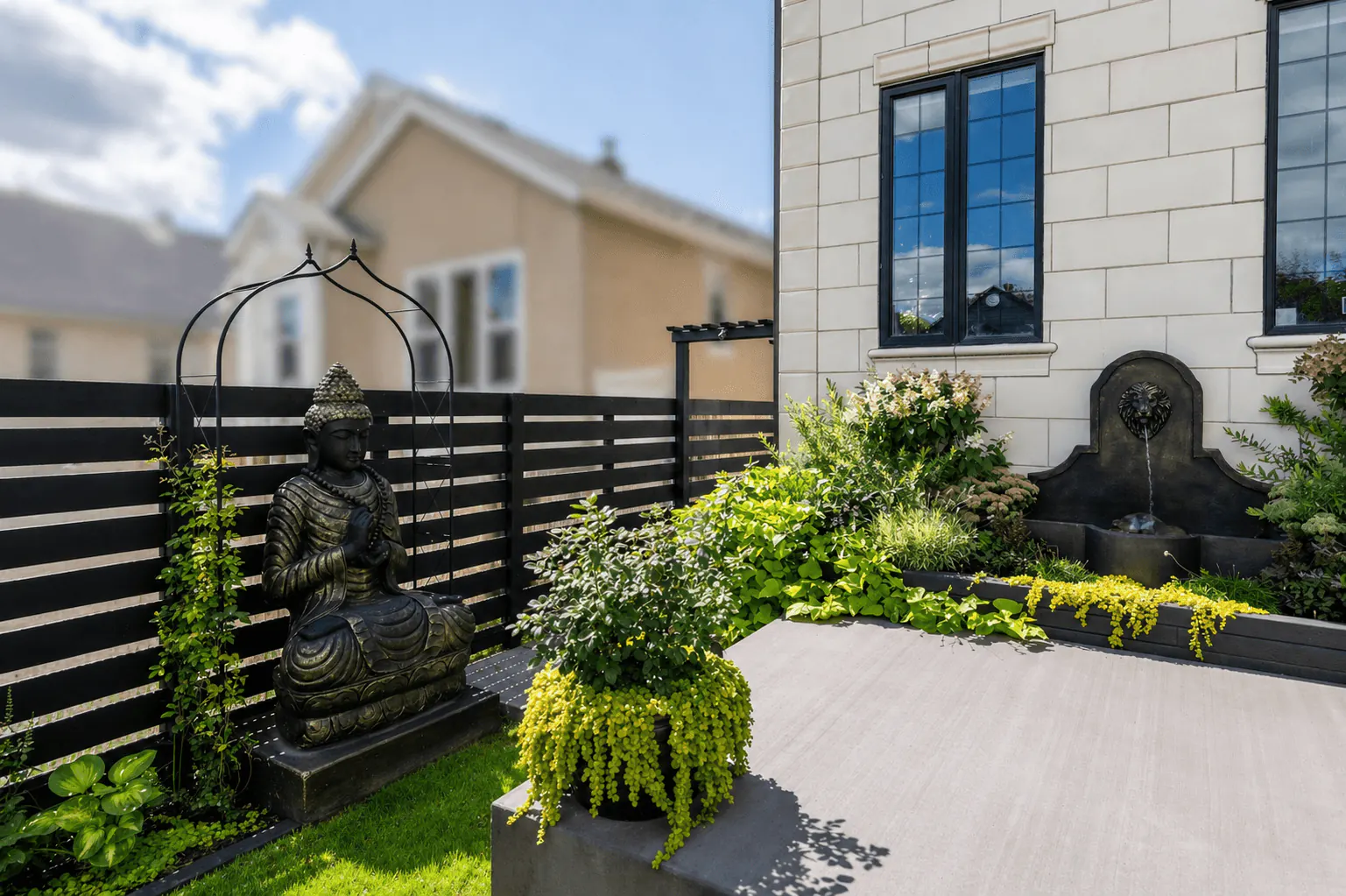
“A focal point works best when the space around it has been composed to hold it.”
This corner shows how the garden shifts from arrival into retreat. The black privacy fence establishes the room, while the statue and fountain give the space a quiet centre of gravity.
Planting softens the walls and the house edge without blurring the circulation. Water, greenery, and concrete remain distinct, so the entrance garden feels calm and usable.
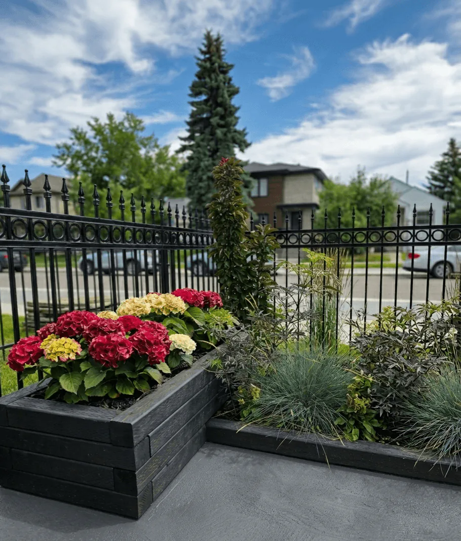
“Raised planters let colour feel deliberate rather than decorative.”
Raised black planter boxes control the planting line along the fence. Hydrangeas, grasses, and dark foliage create depth while the planters keep the composition crisp against the concrete.
The detail matters because this is a close-range view. The planting softens the boundary and adds seasonal colour, but the structure keeps the frontage tailored to the architecture.
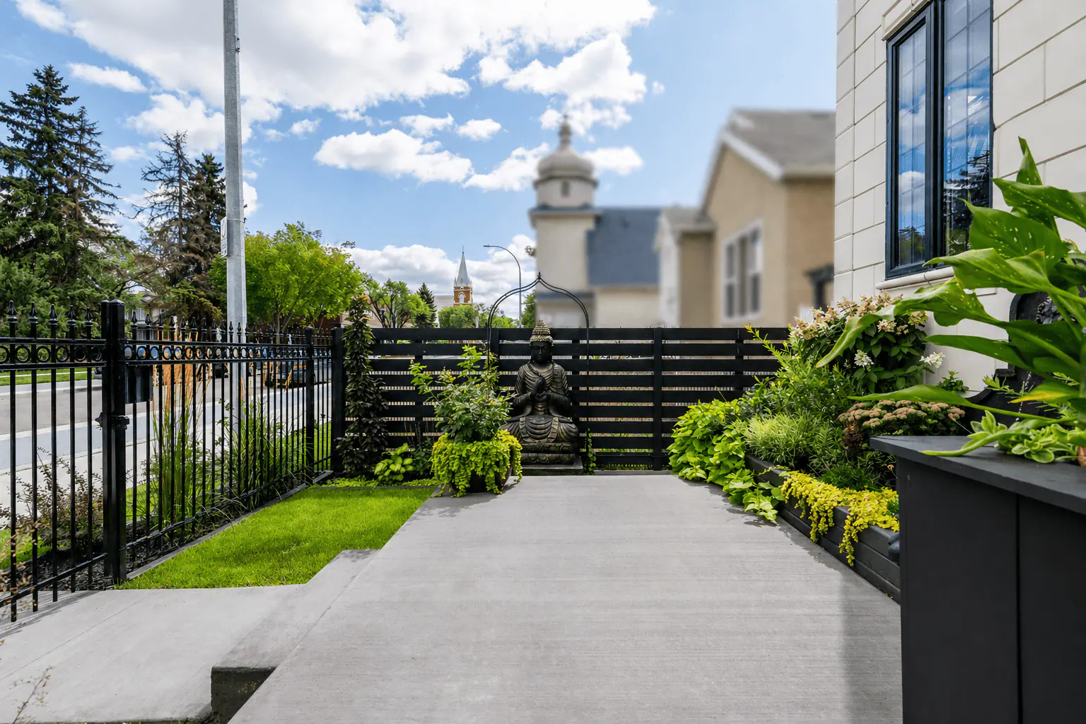
“The most private moment of the frontage is still part of the arrival sequence.”
Here the concrete levels broaden the approach and make the entrance garden feel more spacious. The black fence screens the street, while the statue and layered planting create a clear focal point.
The space still reads with the house. Raised planters soften the facade, the open concrete keeps movement easy, and the planting gives the landing atmosphere without crowding the approach.
“The walk from driveway to front door can become a room in its own right.”
Conceived for a lakehouse, this courtyard is planned as a transitional pause space between driveway and front door. Water, stone, and sculpted planting create an inward-facing calm that slows the approach and gives the entry sequence more ceremony.
Just as important, the courtyard is meant to be seen from the architecture around it. Large garage windows already draw the garden into daily routines, and future entrance glazing would deepen that relationship, allowing the landscape to feel embedded in the life of the home rather than set outside it.
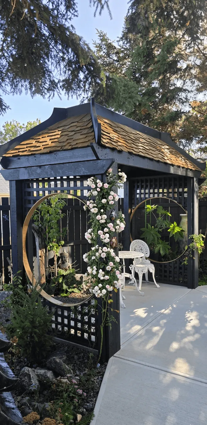
“Shelter is what lets an arrival space feel inhabited rather than merely passed through.”
The pavilion gives the courtyard its inhabitable centre. Rather than treating the space as decorative frontage, this concept imagines an outdoor room where one can pause, reset, and take in the garden before crossing the final steps to the door.
Its value is spatial as much as visual. The structure adds vertical rhythm, frames the surrounding planting, and gives the courtyard the kind of sheltered intimacy that makes arrival feel composed rather than abrupt.
“A transition feels more luxurious when the pace has been deliberately slowed.”
This bridge is not only a connector. It changes tempo. Moving across it, one leaves the directness of driveway and pavement for a more measured sequence of water, planting, timber, and filtered light.
That shift in pace is what gives the courtyard its emotional clarity. The space begins to feel immersive, even meditative, because movement has been shaped with the same attention as the planting and architecture around it.
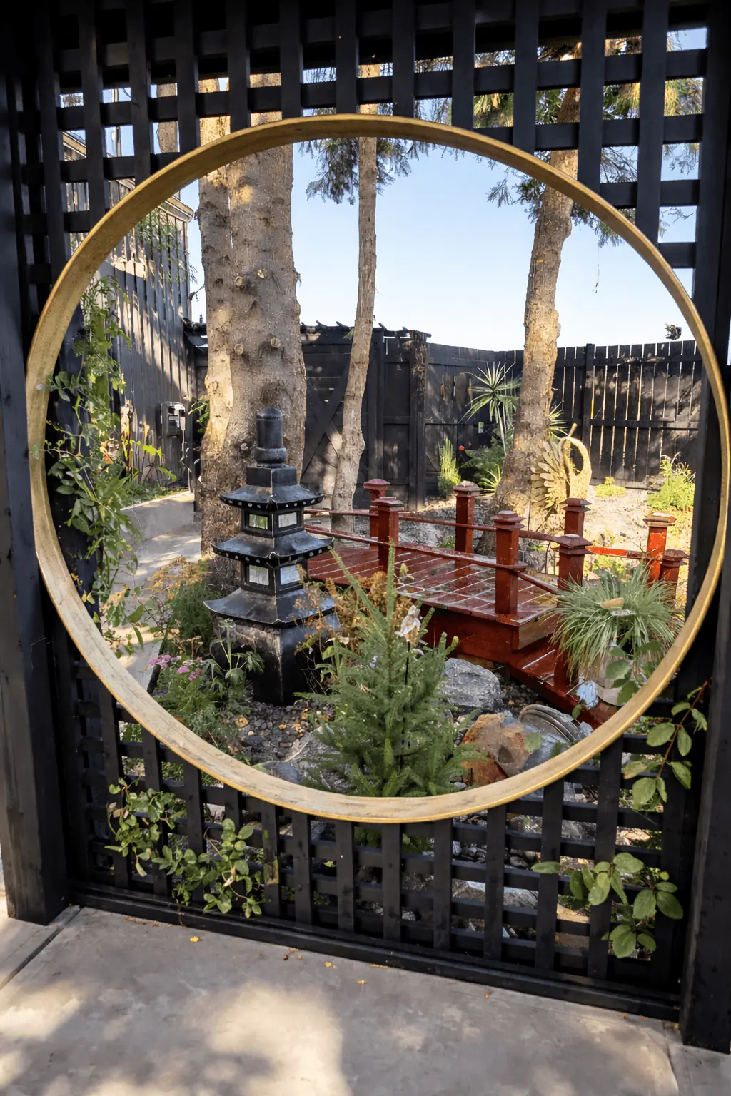
“A courtyard becomes more persuasive when it is composed for both passage and sightline.”
The circular opening turns the courtyard into a deliberate picture plane. Water feature, bridge, and planting are held within one frame, which gives the garden an immediate sense of order and focus.
This matters especially in relation to the house. When viewed through garage windows now, and through future entrance glazing later, the courtyard becomes part of the everyday interior experience rather than a separate exterior scene.
“A larger garden has the opportunity to feel like an escape rather than an extension.”
This concept treats the backyard as a complete outdoor living environment. Bridge crossings, layered planting, water, sculpture, and garden structures are arranged as a sequence of immersive rooms rather than one continuous lawn.
The design ambition is fullness without chaos. Structure provides order, greenery softens the edges, and flowering colour is used to deepen atmosphere, giving the property the feeling of a private retreat held entirely within its boundaries.
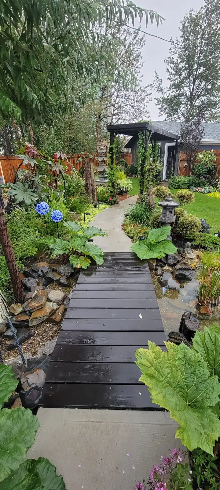
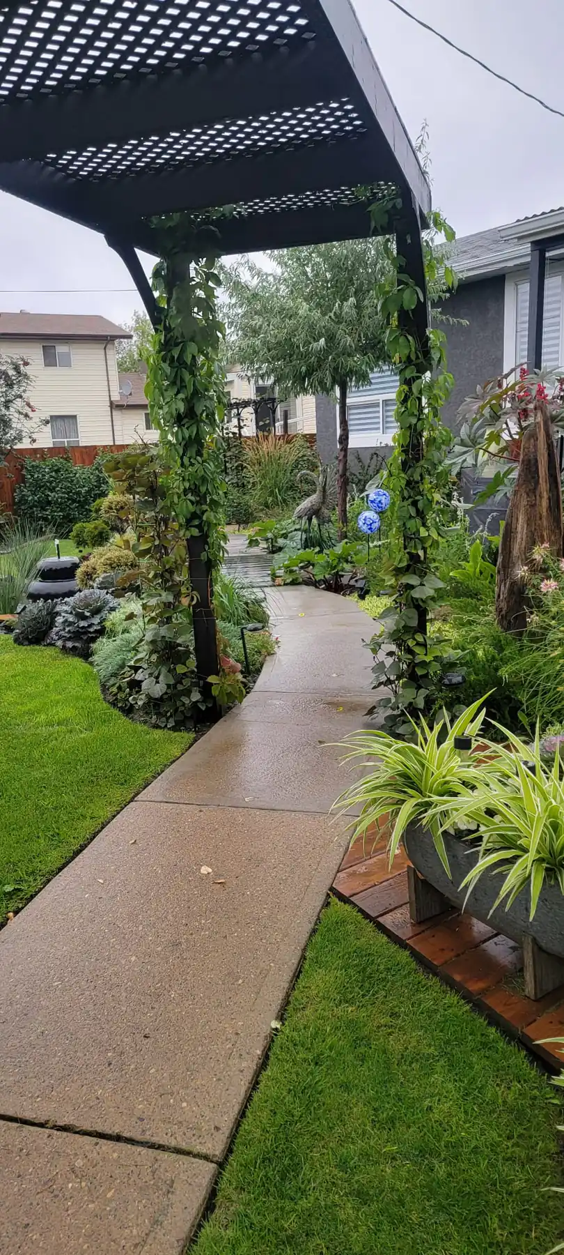
“A garden begins to feel inhabited when movement through it has shape.”
The pergola changes the experience of the path immediately. Overhead structure, climbing greenery, and a narrowing view ahead make the walk feel guided, as though the garden is unfolding in stages instead of revealing itself all at once.
That sequence is what turns a larger footprint into a designed retreat. It allows the garden to feel layered and immersive, with moments of enclosure that heighten the openness beyond them.
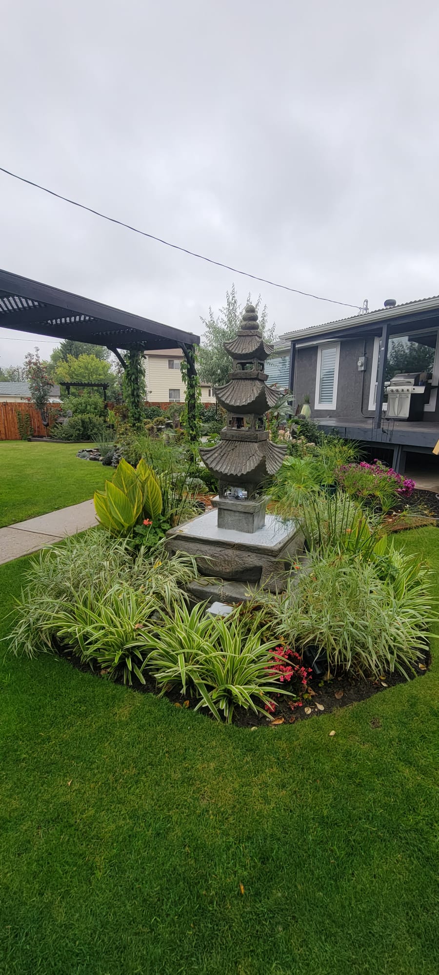
“A focal piece is not decoration alone. It gives the landscape a centre of gravity.”
Placed within a ring of grasses and layered planting, the pagoda form gives the garden an unmistakable centre of gravity. It allows the surrounding lawn and pathways to feel intentional, not leftover.
Focal elements matter most when the rest of the composition supports them. Here, clipped planting, looser texture, and the open sweep of lawn keep the sculpture calm and grounded rather than theatrical.
“The most convincing garden rooms hold structure, softness, and atmosphere at once.”
This perspective shows the concept at its fullest. Pathways, bridge, water, structure, and layered greenery all work together, so the garden reads as a complete environment rather than a collection of isolated features.
That wholeness is the real goal of the design. The space is meant to feel lush, private, and quietly transportive, offering the sense of escape one associates with a destination property while remaining fully part of daily life at home.
“The difference between a decorator and a designer is the difference between selecting finishes and rethinking the space itself.”
Carl Langeveldt is the kind of designer who makes clients feel, within minutes, that their home can become more than they first imagined. He grew up in South Africa, where his eye for beauty, proportion, and atmosphere developed early, and later spent formative years in London, immersed in one of the world's great design capitals. In June 2016, he purchased Interiors On Main from Judy McLean and stepped into its next chapter on Main Street in historic downtown Camrose. The decade since has defined his work in Central Alberta.
What sets Carl apart is that he does not approach a house as a decorator working on the surface. He approaches it as a designer. He takes architectural drawings or existing floor plans and redraws them, studying layout, light, traffic flow, storage, and proportion before a finish is ever chosen. Kitchens and cabinetry remain a signature part of his practice, but the studio moves comfortably through full-space planning, furniture selection, tile coordination, window fashions, custom art, and the quieter design decisions that make a room feel complete rather than simply furnished.
Clients who step into Interiors On Main are stepping into a full-service studio with access to trusted Canadian suppliers, dealer-exclusive lines, and a designer whose work has been featured in magazines and shaped by international experience. Very few designers in Central Alberta can make those claims with substance behind them. Carl brings a point of view formed well beyond this region, then translates it into homes that feel personal, livable, and deeply considered from the first sketch to the final selection.
The pages that follow are the proof. Ahead is a portfolio of kitchens, custom millwork, full interiors, and finished rooms already delivered for real clients. Some are bold and architectural. Some are quiet and deeply resolved. All of them show the same through-line: Carl's ability to take possibility, refine it with discipline, and turn it into spaces that feel elevated, intentional, and meant to be lived in.
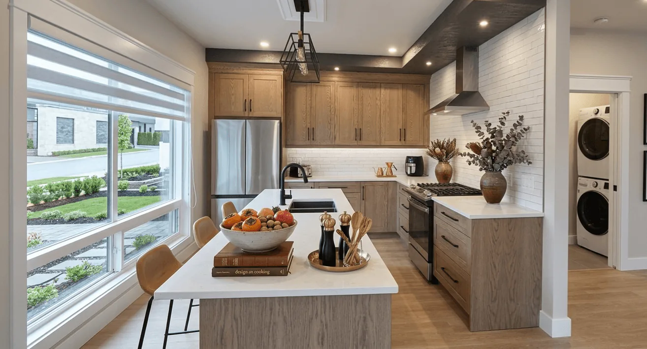
“What looks generous is actually very tightly controlled.”
The island establishes the room before the pendants do. Its dark base gives the kitchen weight, while the pale perimeter and long floorboards keep the eye moving cleanly to the sink wall.
Study the length of the counter, but also the discipline beneath it. Repeated drawer fronts, modest hardware, and uninterrupted walking space are what let a kitchen of this scale feel calm rather than oversized.
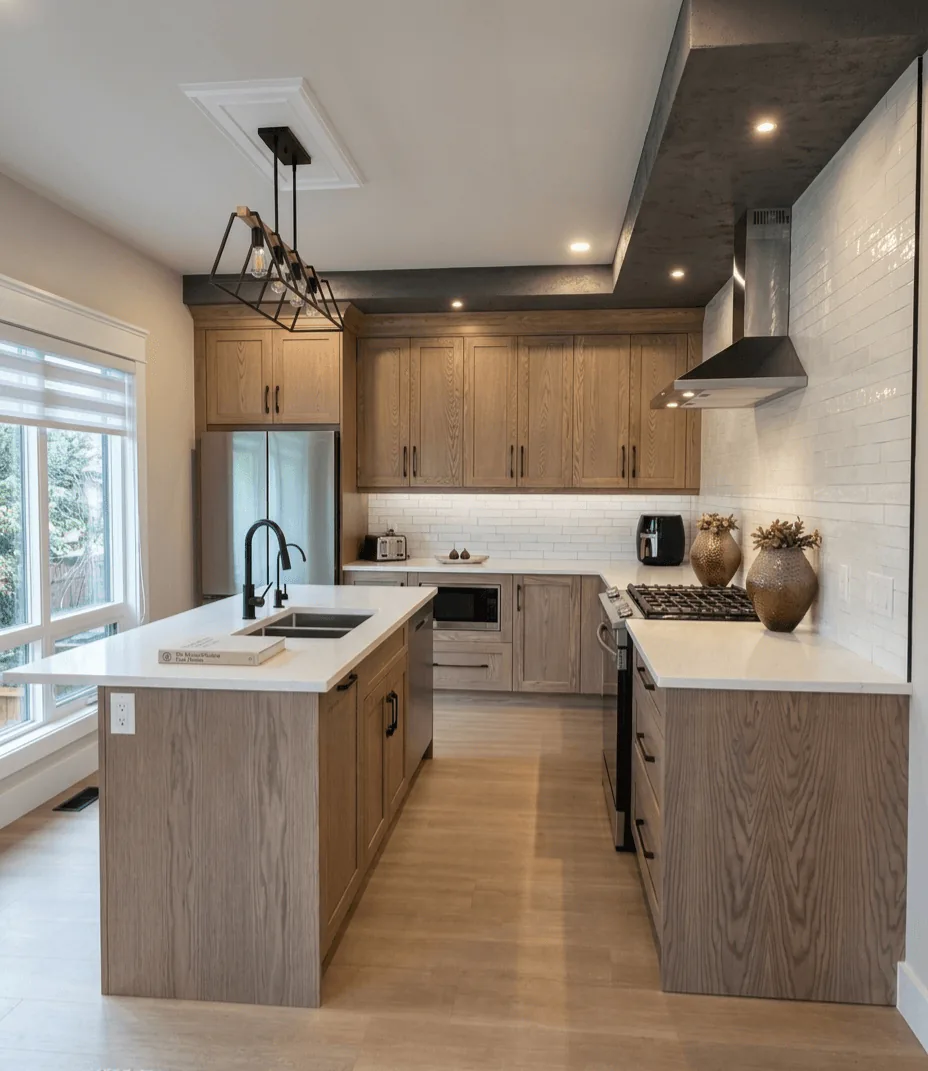
“From this angle the kitchen stops being a workspace and becomes the social centre of the floor.”
The row of stools changes the reading of the island immediately. What could have been a purely functional block becomes a place to linger, with the dining zone and windows extending the room well past the cooktop.
It is worth noticing how seating has been handled. There is enough overhang to be comfortable, but the aisle still stays generous, which is exactly the kind of quiet planning that makes a kitchen feel easy every day.
“A first impression can be quiet and still unmistakably designed.”
This is not a decorative entry. It is a working threshold shaped into something composed: tall storage, a built-in seat, and black floor tile that gives the pale cabinetry something firm to land on.
The detail to notice is the way the cabinet crown follows the pitched line beside it. Small alignments like that are what make millwork feel native to a home rather than installed into it.
“The room gets its atmosphere from material depth, not from excess.”
A long vanity wall, paired mirrors, and textured brick give this bathroom its identity immediately. The darker cabinetry grounds the room, while the pale counter and window trim keep the palette from closing in.
Look closely at the light strategy. The linear wash at the ceiling edge softens the dark millwork, and the daylight at the end of the run keeps the composition breathable. In a bathroom, that balance is often the difference between dramatic and oppressive.
“Small rooms reward the designer who knows where to spend space.”
This suite kitchen is compact, but the layout refuses to feel compromised. The island becomes prep space, dining edge, and visual divider at once, while the oak cabinetry keeps the room warm enough to read as a stay, not a utility zone.
Pay attention to the window wall and the service opening in the background. When secondary functions are tucked cleanly into the plan, the main room can remain open and composed.
“Efficiency is convincing only when it still feels relaxed.”
From this angle, the room reads as a very controlled galley. The island, range wall, and refrigerator line sit in direct conversation, which shortens every movement without making the plan feel tight.
What a homeowner might notice here is the amount of clear counter kept around the work zones. Good kitchens are not only about what gets added. They are about what is left open on purpose.
“The emptier view often tells the truth about the design.”
Stripped of styling, this room still feels complete. The scale of the window, the soft drapery, and the pale floor do most of the work, proving that the architecture and window treatment were carrying the atmosphere all along.
It is a useful lesson when planning a space of your own. If a room looks resolved before the furniture arrives, the underlying decisions are probably right.
“Privacy should arrive without flattening the day.”
Here the eye goes straight to the shade, which is exactly the point. The layered banding tempers glare and privacy in the same move, yet it still lets the room keep its daylight and view.
For anyone studying their own windows, notice the proportion of the casing and the way the treatment sits within it. Clean trim and an appropriately scaled shade make the control look architectural instead of added late.
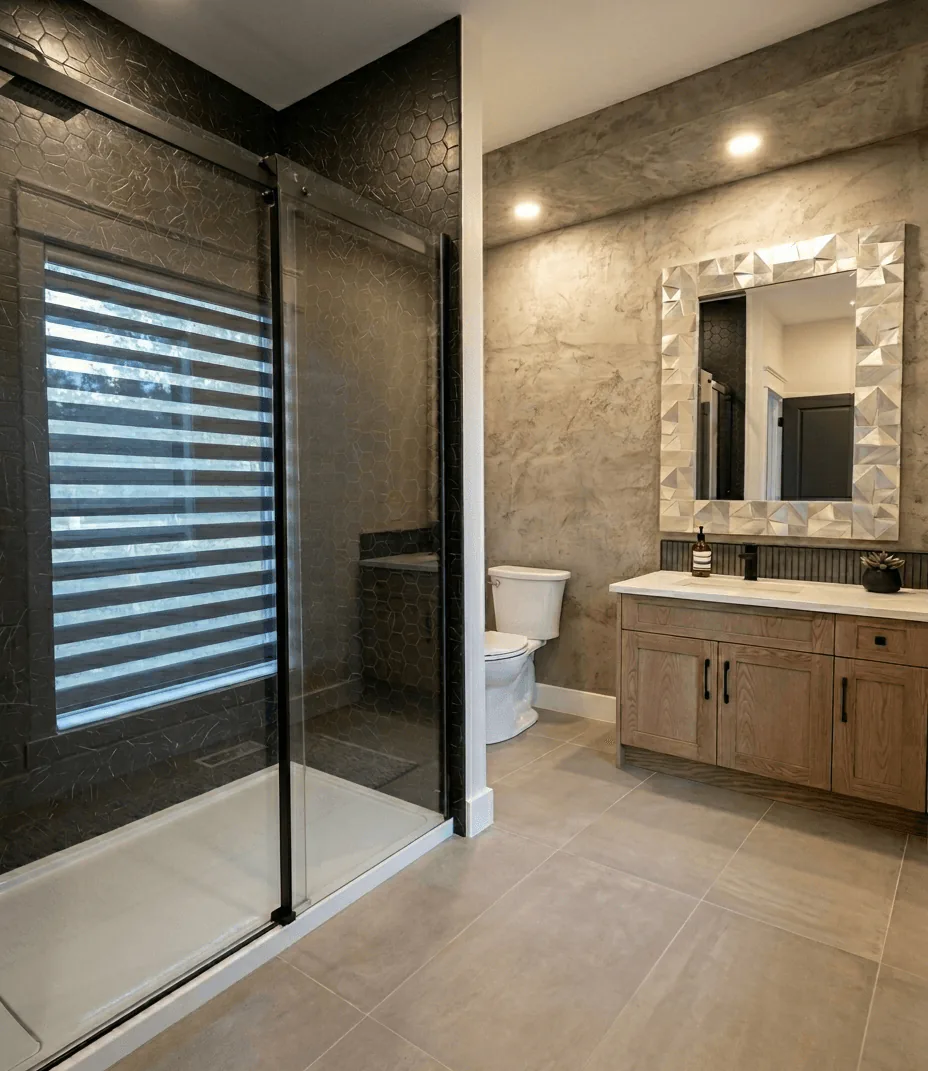
“A compact bathroom can take a firmer point of view.”
This is where the suite stops being merely practical and becomes memorable. Dark tile, a warm vanity, and a faceted mirror give the room shape, while the lighter floor keeps the weight off the ground.
The shower enclosure deserves a close look. Framing the darker tile in glass lets the stronger material stay visible, which makes the bathroom feel larger than if everything had been diluted.
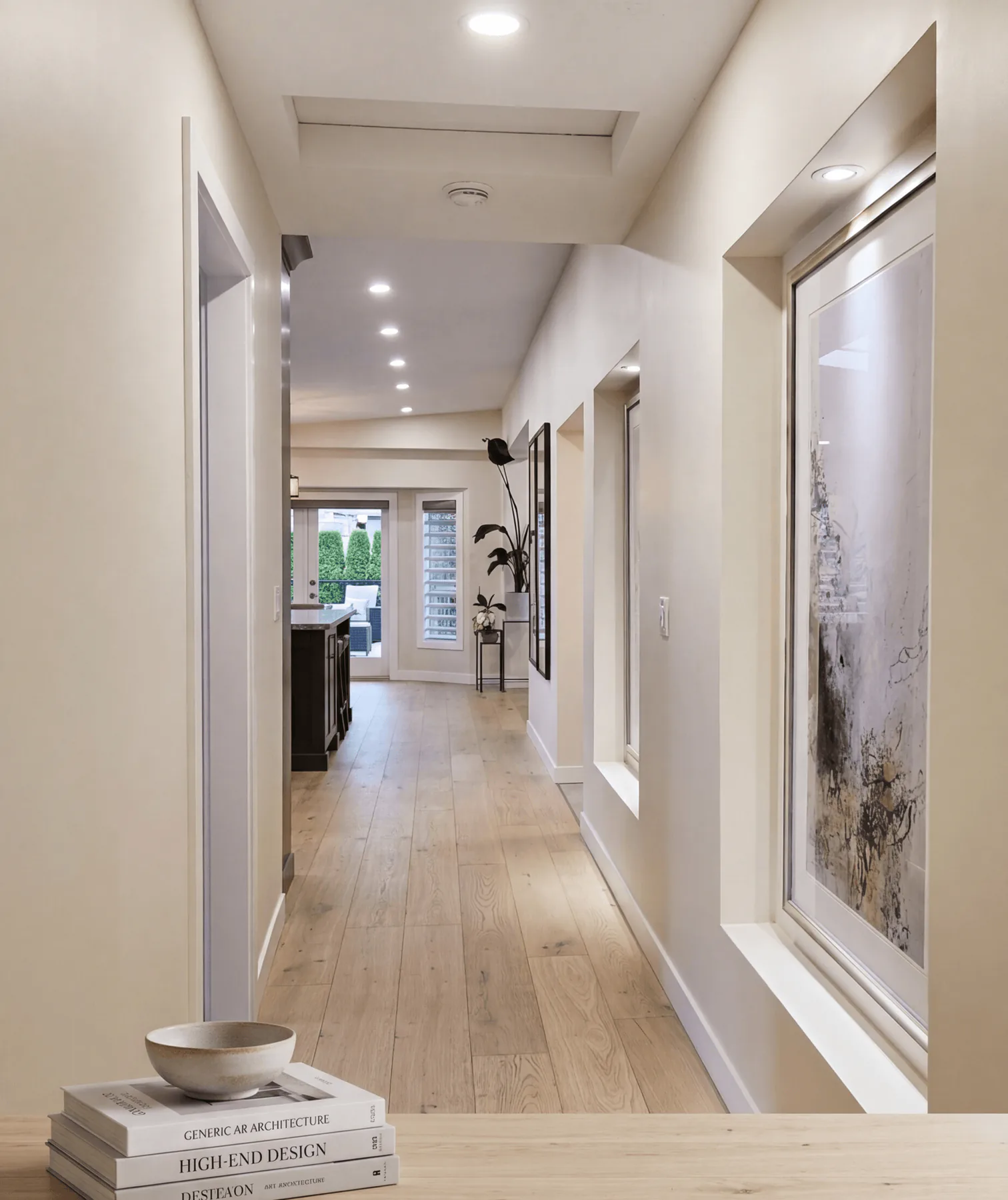
“A full-home project is often felt first as sequence.”
This corridor sets the temperament of the house before a single feature room is fully seen. Oak floorboards pull the eye forward, while the lit recesses interrupt the length just enough to make the walk feel intentional.
That is a designer kind of control. When circulation has rhythm, the rooms beyond arrive with more presence because they have been introduced, not simply exposed.
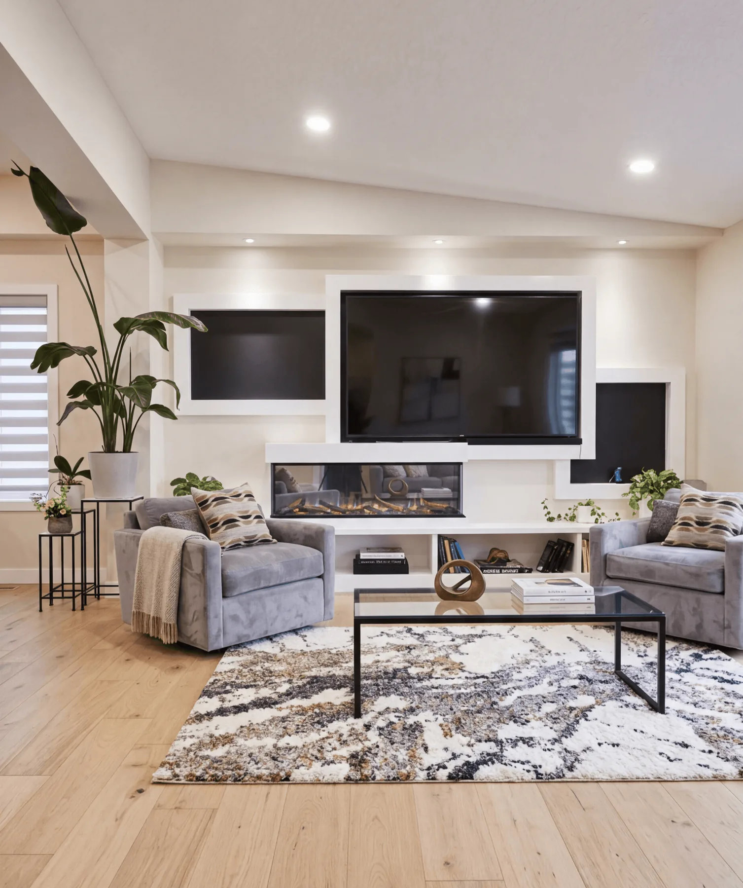
“Comfort becomes sharper when the wall behind it has structure.”
The fireplace wall is handled like composed millwork rather than a television problem. White framing, dark inserts, and the low ribbon of fire give the room definition without dragging the whole palette darker.
Notice how the chairs sit slightly proud of the rug and glass table. In living rooms, spacing is as important as upholstery. The room feels open because the furniture has been given room to breathe.
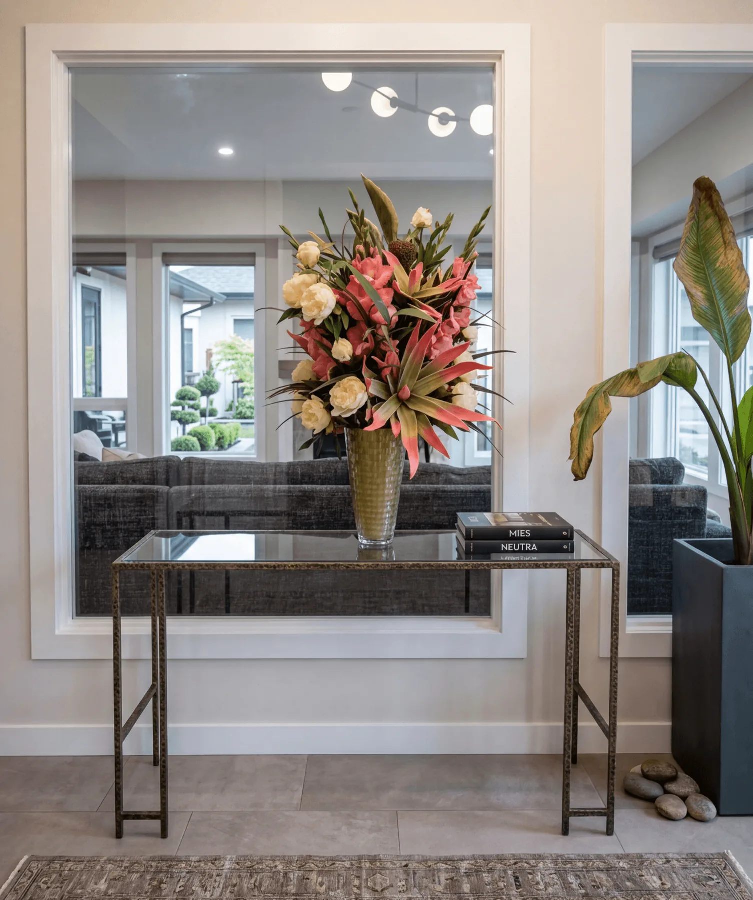
“Some of the most persuasive design happens between the major rooms.”
A slim console, large reflections, and one abundant arrangement turn a circulation moment into an event. It is a soft move, but it makes the transition between rooms feel curated rather than accidental.
Homeowners often underestimate these in-between spaces. They are where sightlines stack, and where a house starts to feel finished instead of simply complete.
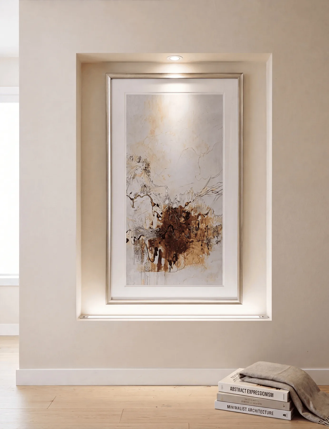
“When art is given architecture, the wall changes status.”
This niche does more than display a piece. It frames it, lights it, and gives it enough margin to hold the wall on its own, which is why the whole hall feels quieter and more assured.
It is worth noticing the restraint around it. No competing trim, no extra objects, just a clear recess and a measured light source. That simplicity is what makes the gesture look expensive.
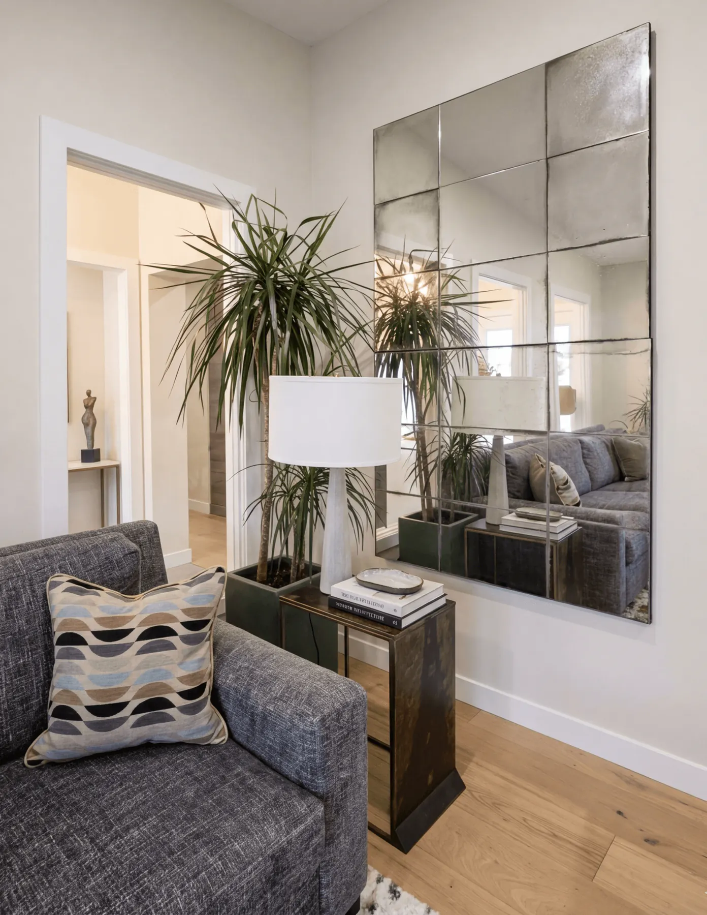
“Reflection can enlarge a room without making it louder.”
Seen from this corner, the mirrored paneling becomes a tool rather than decoration. It lengthens the room, returns light into the seating area, and gives the plant and lamp a deeper backdrop than paint alone could provide.
The lesson here is proportion. Large reflective surfaces work best when the rest of the vignette is grounded, and the low side table and substantial sofa do exactly that.
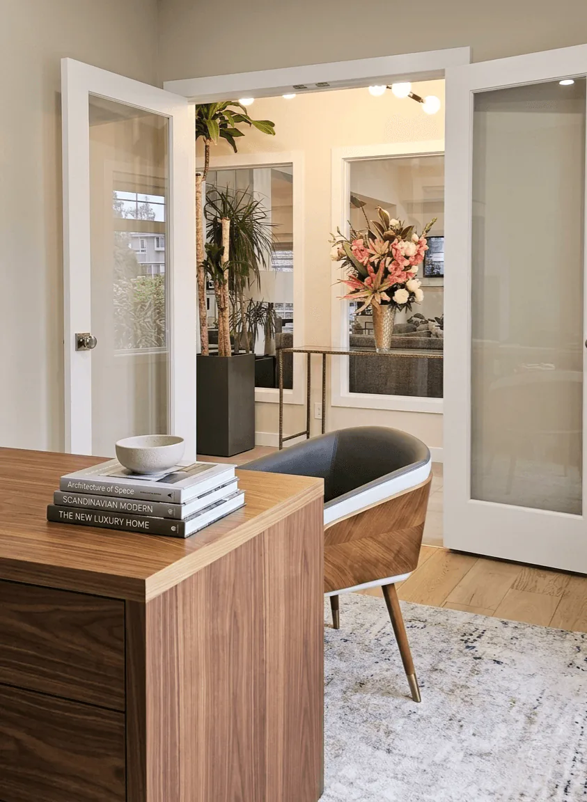
“A work room can feel distinct without cutting itself off from the house.”
Through the glazed doors, the office reads as part of the larger composition. The walnut desk, sculptural chair, and soft rug keep it professional, but never cold.
The doors are the detail to study. Transparency lets the room borrow light and connection, while the frame still gives it definition. That balance is especially useful in homes that need focus without isolation.
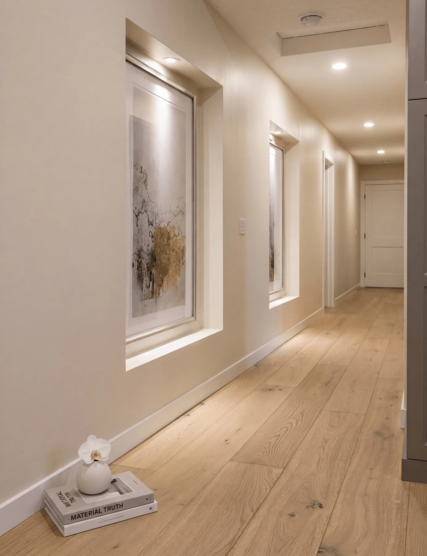
“Long walls are an opportunity if they are given cadence.”
This perspective shows how the hall has been broken into moments. Artwork sits in deep reveals, light is tucked rather than announced, and the floor line carries everything forward.
Many corridors are treated as leftover space. Here, the passage itself becomes part of the design story, which is why moving through the house feels considered rather than purely functional.
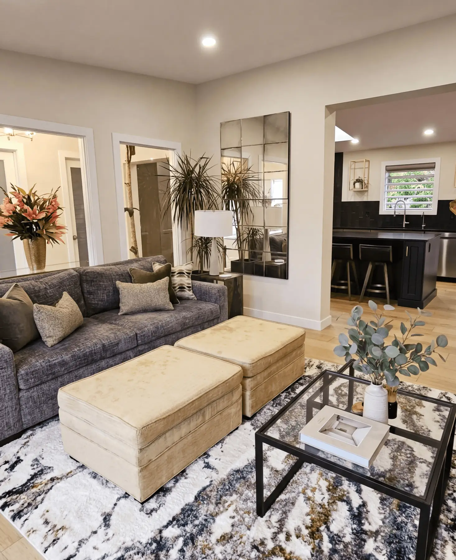
“Open plan succeeds when each zone still knows its role.”
From the living room, the darker kitchen reads as a defined destination rather than background. The sofa, ottomans, and patterned rug keep the seating area grounded, so the transition into the kitchen feels clear.
This is a useful thing to notice in open homes: contrast can separate rooms more gracefully than walls. When materials shift with intention, the plan stays open without losing order.
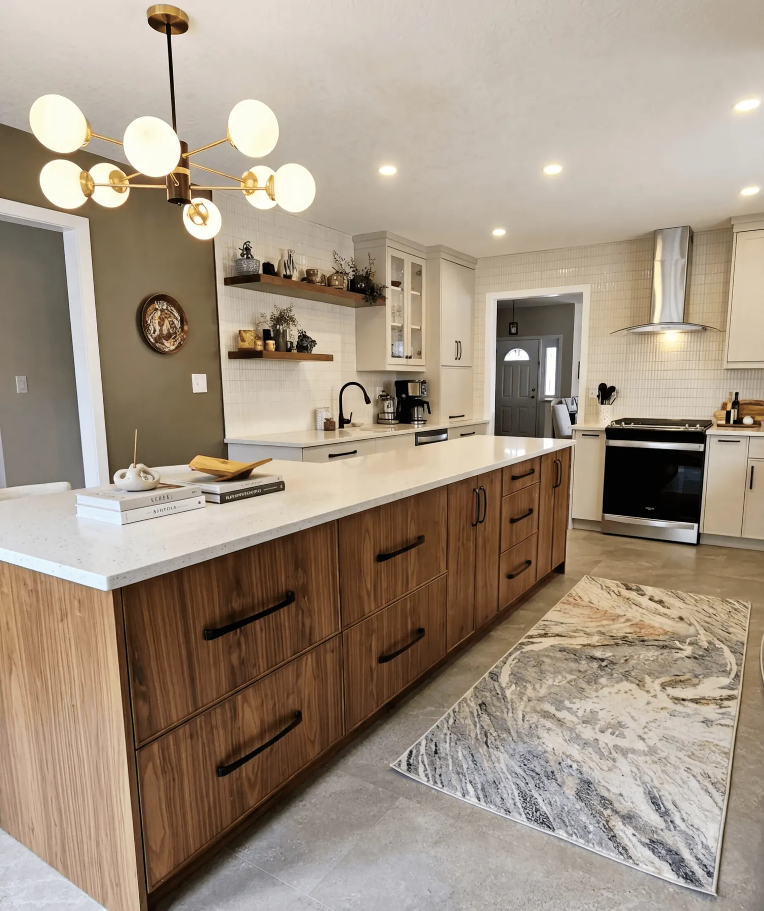
“The room is generous, but the order inside it is what persuades.”
The island is doing more than offering storage. It establishes the axis of the whole kitchen, with the chandelier, shelves, and range wall all reading against it.
Look closely at the drawer rhythm and the amount of landing space around the perimeter. Those are the decisions that make a kitchen easy to live in long after the first impression of walnut and stone has passed.
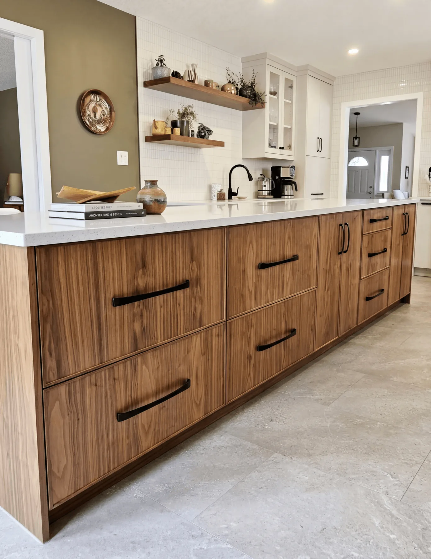
“Close views tell you whether the discipline is real.”
At this distance, the cabinetry has nowhere to hide. Grain direction, handle scale, and the spacing of the drawer fronts all have to hold together, and here they do.
This is the sort of detail a homeowner should study before finalising millwork. A large pull can either overpower a cabinet or give it architecture. In this case, the proportion is what makes the island feel custom.
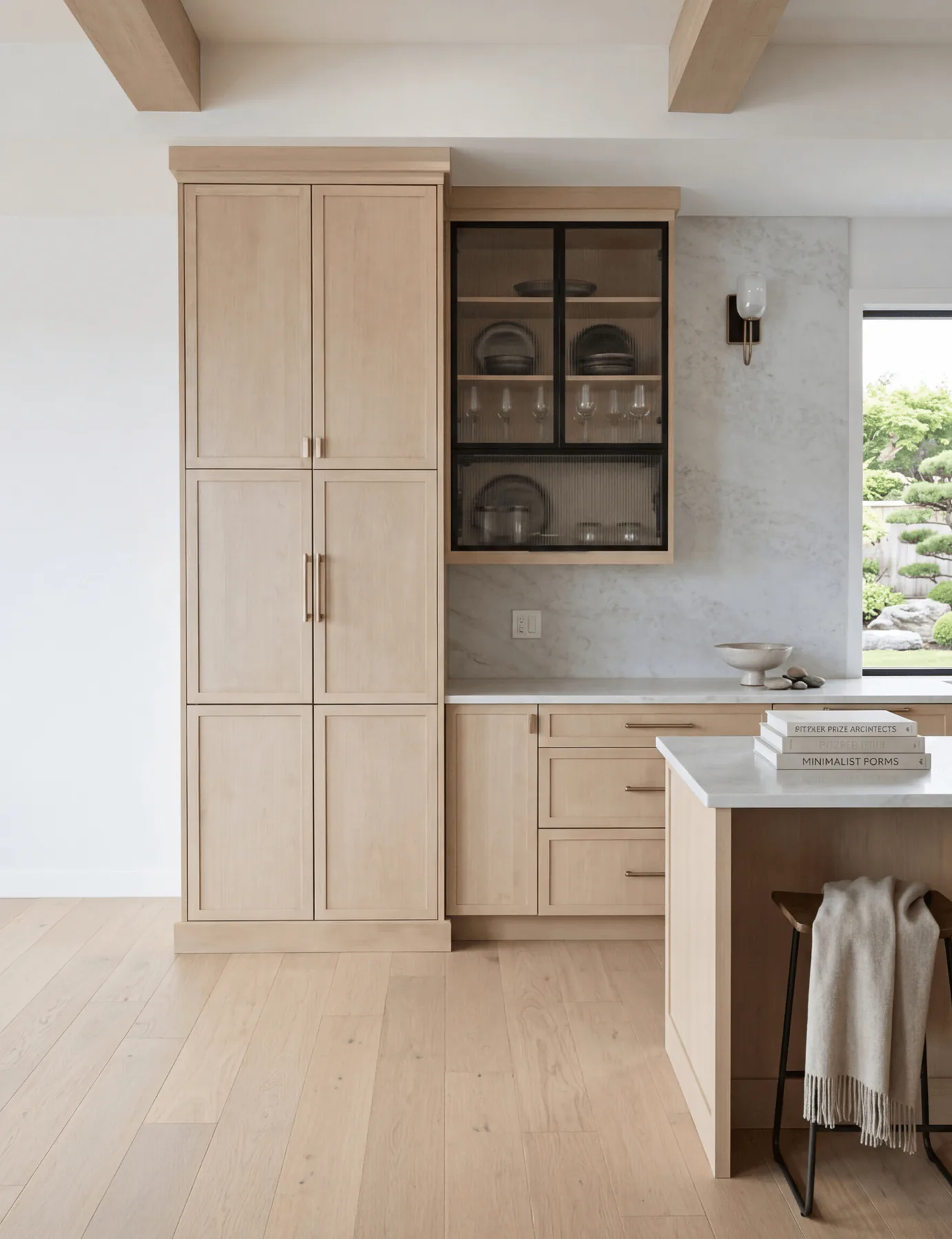
“A light palette has to be precise to avoid disappearing.”
This kitchen relies on nuance rather than contrast. Pale oak, soft stone, and black-framed glass create a room with very little visual noise, which makes the craftsmanship easier to read.
The cabinet and display pairing is worth noticing. One side hides volume, the other reveals it. That balance between closed storage and visible order is often what keeps a minimalist kitchen from feeling sterile.
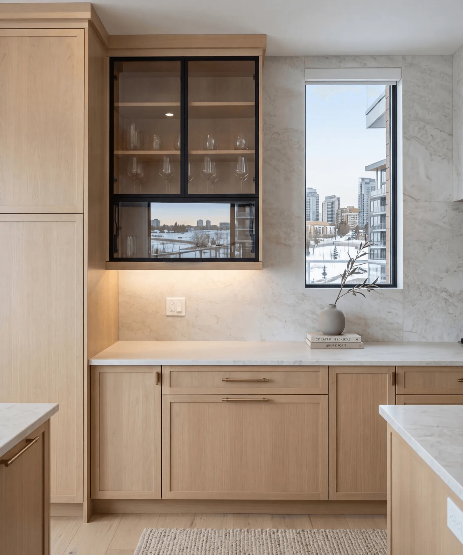
“A single framed cabinet can change the whole register of a wall.”
Here the eye lands on the glass-front cabinet and the narrow window beside it. Together they create a pause in the run of oak, bringing lightness to what could have been an entirely solid wall.
The detail to study is the black frame. It adds structure without adding weight, which is a useful strategy when a room needs definition but not more mass.
“Sometimes one wall carries the whole argument of the room.”
This elevation shows how much calm can be built from very few gestures. A pared-back hood, two sconces, and a long stone field give the wall quiet authority.
Notice how the upper cabinet stops short of symmetry by just enough to feel considered rather than rigid. That is often where refinement lives, in the slight adjustment that keeps a room human.
“Contrast feels mature when every note is kept under control.”
The olive wall, white cabinetry, walnut island, and black accents could easily have fought one another. Instead, they read as a measured composition because no one element is trying to dominate the rest.
Homeowners studying their own kitchens should notice the shelf styling and the restrained hardware. When the permanent elements are clear and simple, personality can come through without turning the room into a theme.
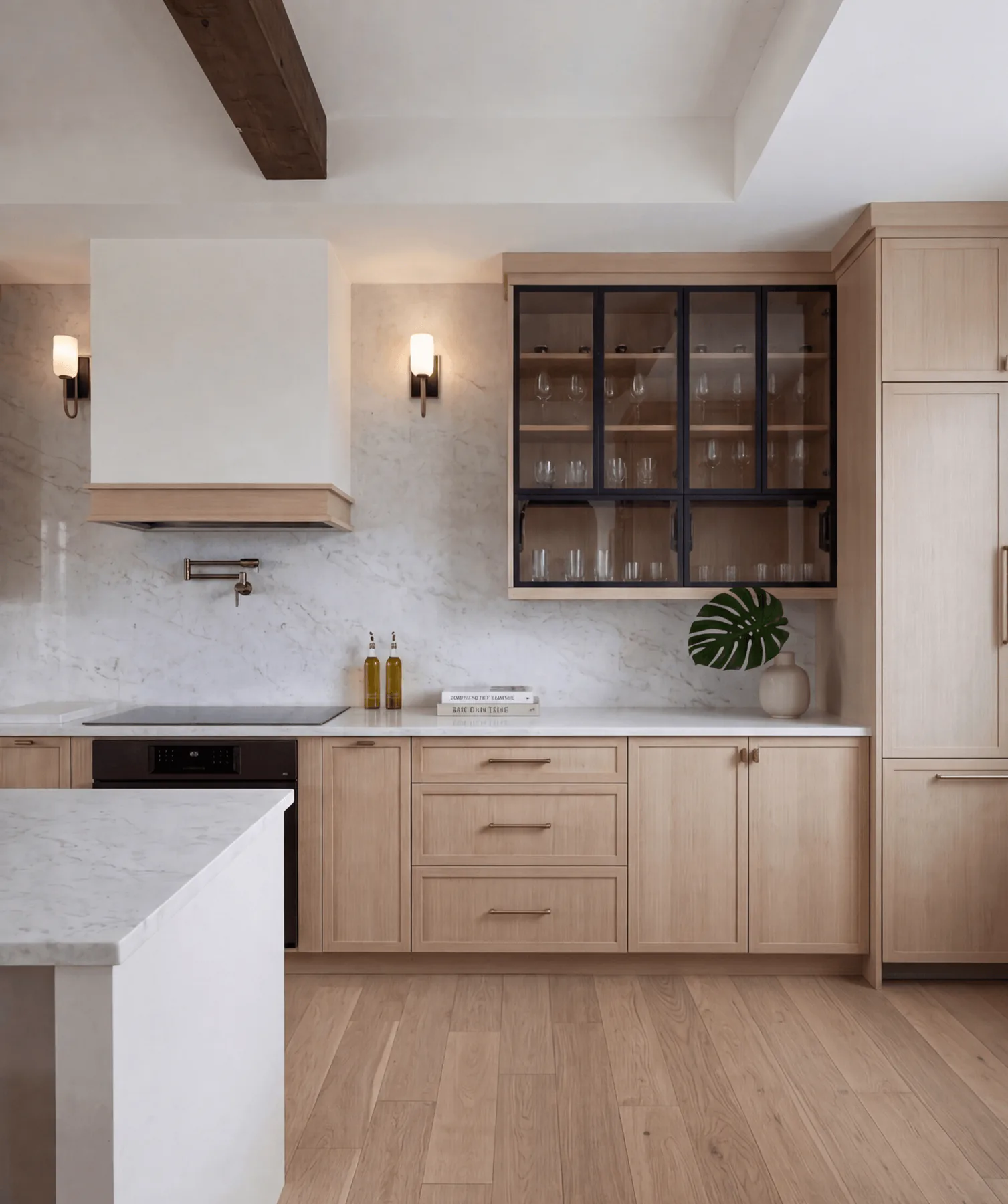
“The supporting wall is often where a kitchen proves itself.”
This service zone is handled with the same seriousness as the main cooking wall. Open shelves, glass uppers, beverage storage, and a prep sink turn the everyday rituals into part of the design, not an afterthought.
The useful detail is the mix of open and closed storage. A room stays calm when frequently used objects are easy to reach, but not everything is asked to perform visually.
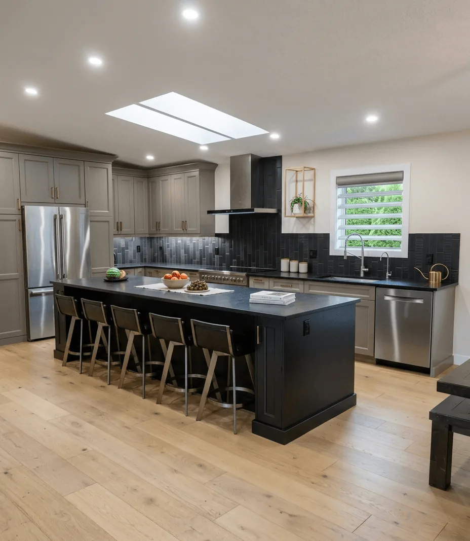
“Overhead light changes the logic of the room.”
The skylight does more than brighten the kitchen. It lifts the darker island and black backsplash out of heaviness, allowing the deeper finishes to feel crisp rather than dense.
It is a smart lesson in sequencing. When natural light is doing the major work, the rest of the palette can afford more contrast without losing ease.
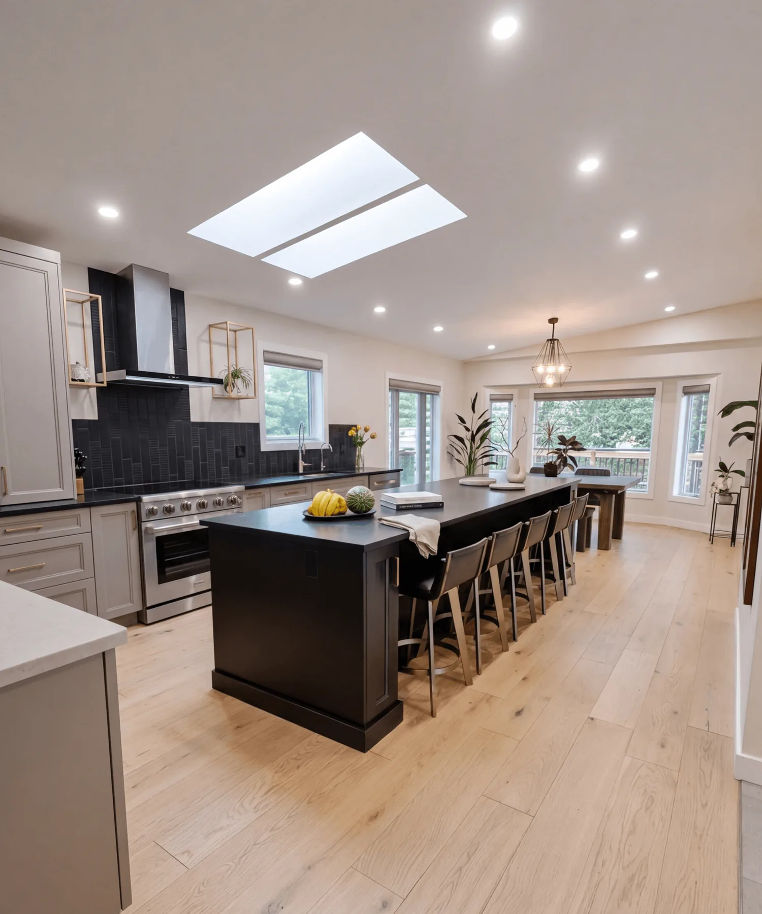
“A long island has to serve the room from more than one side.”
From this end, the island reads as a shared table as much as a work surface. Seating, prep zone, and the view toward the dining area are all held in one long gesture under the skylight.
Notice how much clear circulation remains around it. Scale only feels luxurious when movement stays easy, especially in a kitchen built to host.
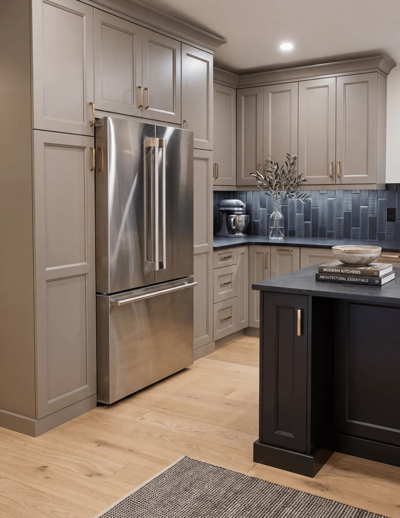
“Large storage walls need quiet detailing more than they need drama.”
This corner proves how much cabinetry can be present without taking over the room. The tall refrigerator wall, warm grey paint, and black counters are all substantial, but the panel profiles and brass hardware keep the mass elegant.
For anyone planning a larger kitchen, this is the detail to study. Tall storage feels intentional when it reads as one composed wall, not as a collection of individual boxes.
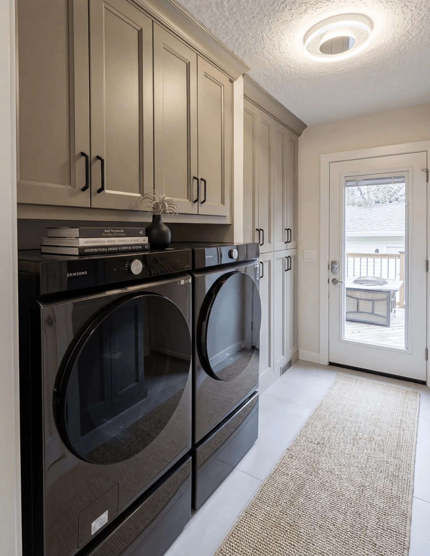
“Back-of-house spaces feel better when they speak the same language as the kitchen.”
The laundry continues the kitchen palette rather than abandoning it. Full-height cabinetry, stacked machines, and a direct exterior door make the room highly practical, but the measured detailing keeps it from feeling like a downgrade.
That continuity matters more than people expect. When service spaces carry the same level of design intelligence, the entire house feels more coherent.
“A focal wall can be bold without breaking the room.”
This is the sharpest view of the black tile and metal hood, and it shows why the choice works. The textured vertical tile gives the wall depth, while the pale cabinetry and wood floor stop it from reading harsh.
The small gold accent by the window is easy to miss, but that kind of note is often what makes a composition feel finished. A room remembers restraint more than novelty.
“A work room should support concentration before it starts talking about style.”
The view is structured around three things: the desk, the large window, and the dark green wall that gives the back of the room its depth. The patterned drapery adds movement, but the palette stays controlled enough to keep the eye settled.
A homeowner studying this room should pay attention to glare management. The blinds do the practical work, while the side panels give the window presence. That combination is what makes an office feel finished rather than furnished.
“Colour feels most expensive when it is contained by strong joinery.”
The sage upper cabinets introduce personality, but the room gets its seriousness from the walnut below and the lit display cabinet at centre. Nothing is loud, yet the composition is unmistakably deliberate.
The detail worth borrowing is the contrast in transparency. Most of the storage stays solid and calm, while the glazed section invites a curated layer. That small shift keeps the wall from feeling flat.
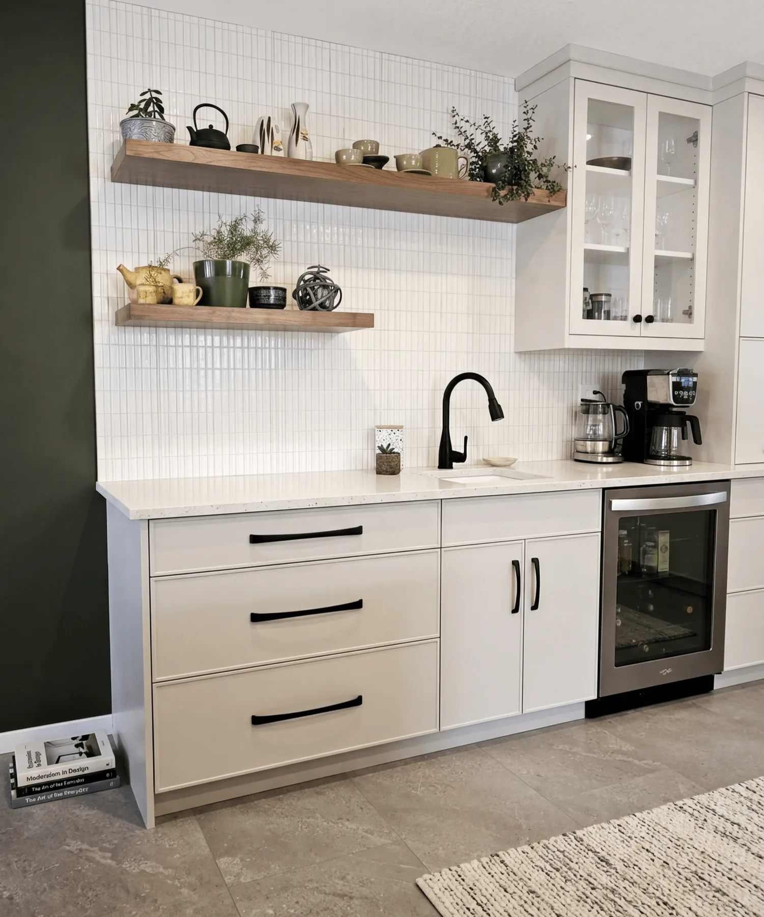
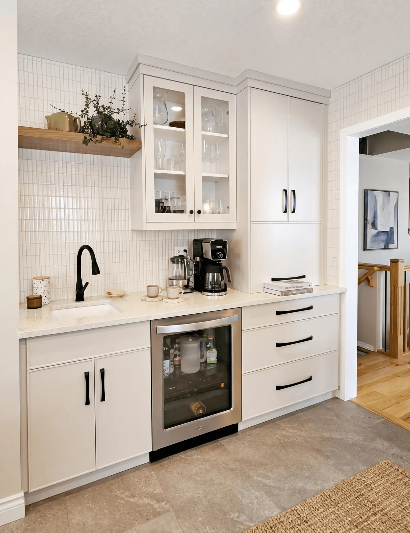
“Even the workrooms can carry a sense of finish.”
This laundry is resolved the way many kitchens wish they were. Upper cabinets clear the clutter, the counter stretches uninterrupted across the machines, and the sink is given enough room to function without looking squeezed in.
The lesson here is in proportion. Tall storage, overhead storage, and open counter have all been balanced so the room still feels bright. Utility does not have to come at the cost of ease.
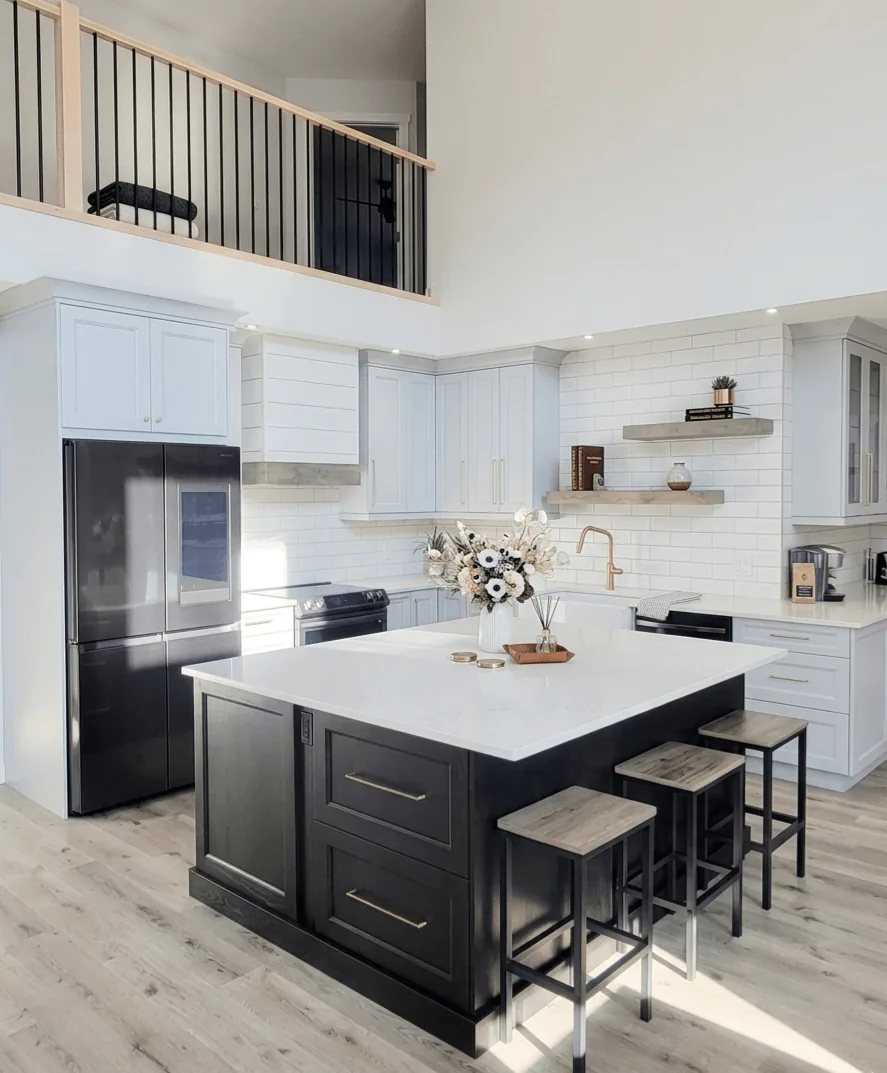
“Height is beautiful, but it still needs something to hold it.”
With the railing and upper level overhead, this kitchen could easily have felt all volume and no centre. The dark island fixes that immediately, giving the room a grounded middle against the pale cabinetry and white tile.
The detail to notice is how the island colour is repeated sparingly in the appliances and hardware. Repetition is what makes contrast feel intentional instead of abrupt.
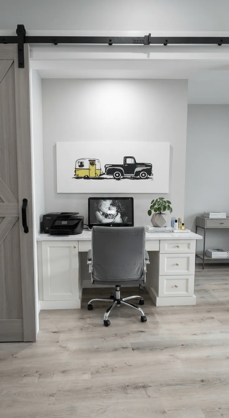
“A compact workspace can feel complete if it is given real edges.”
This office is a niche, not a spare room, and that is precisely what makes its clarity impressive. The sliding barn door establishes a threshold, while the built-in desk turns the recess into purpose rather than leftover square footage.
Look at the depth of the worktop and the placement of the drawers. Small work areas succeed when every inch has a role, especially when the room still needs to feel open beyond the task at hand.
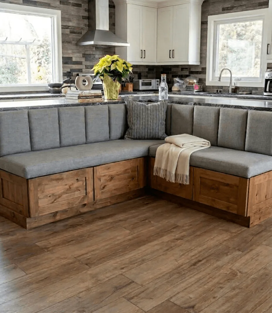
“The best custom seating solves the room before it styles it.”
This built-in bench does more than create a comfortable place to sit. It turns an awkward corner into an anchored dining zone, with wood base panels that give the upholstery a sense of permanence.
There is a practical detail here worth keeping in mind. The seating depth stays generous without crowding the kitchen behind it, which is exactly the sort of measurement choice that determines whether custom work truly improves daily life.
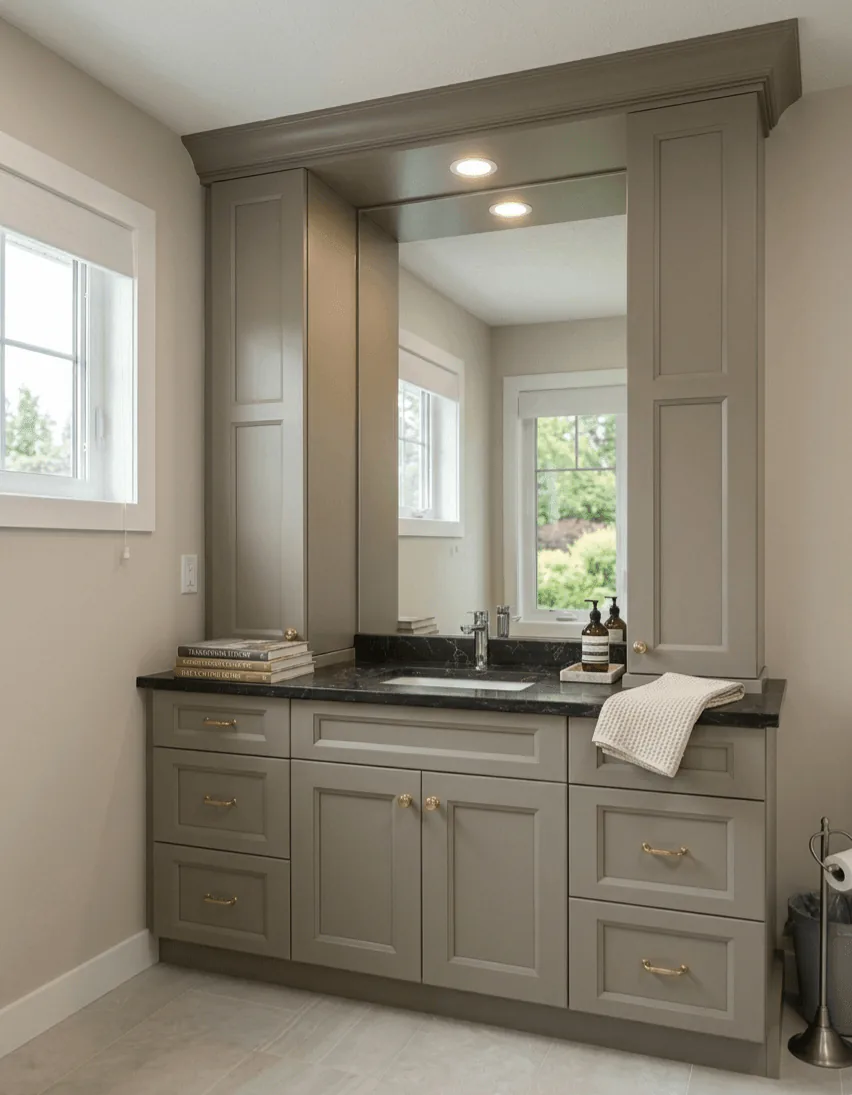
“A restrained bathroom can still feel richly considered.”
This vanity wall relies on proportion more than ornament. The tall mirror surround gives the room height, the dark counter adds weight, and the gold hardware keeps the grey cabinetry from going flat.
The smartest move may be the lighting tucked into the bridge above the mirror. In smaller bathrooms, light placed within millwork can do the work of extra decoration without adding clutter.
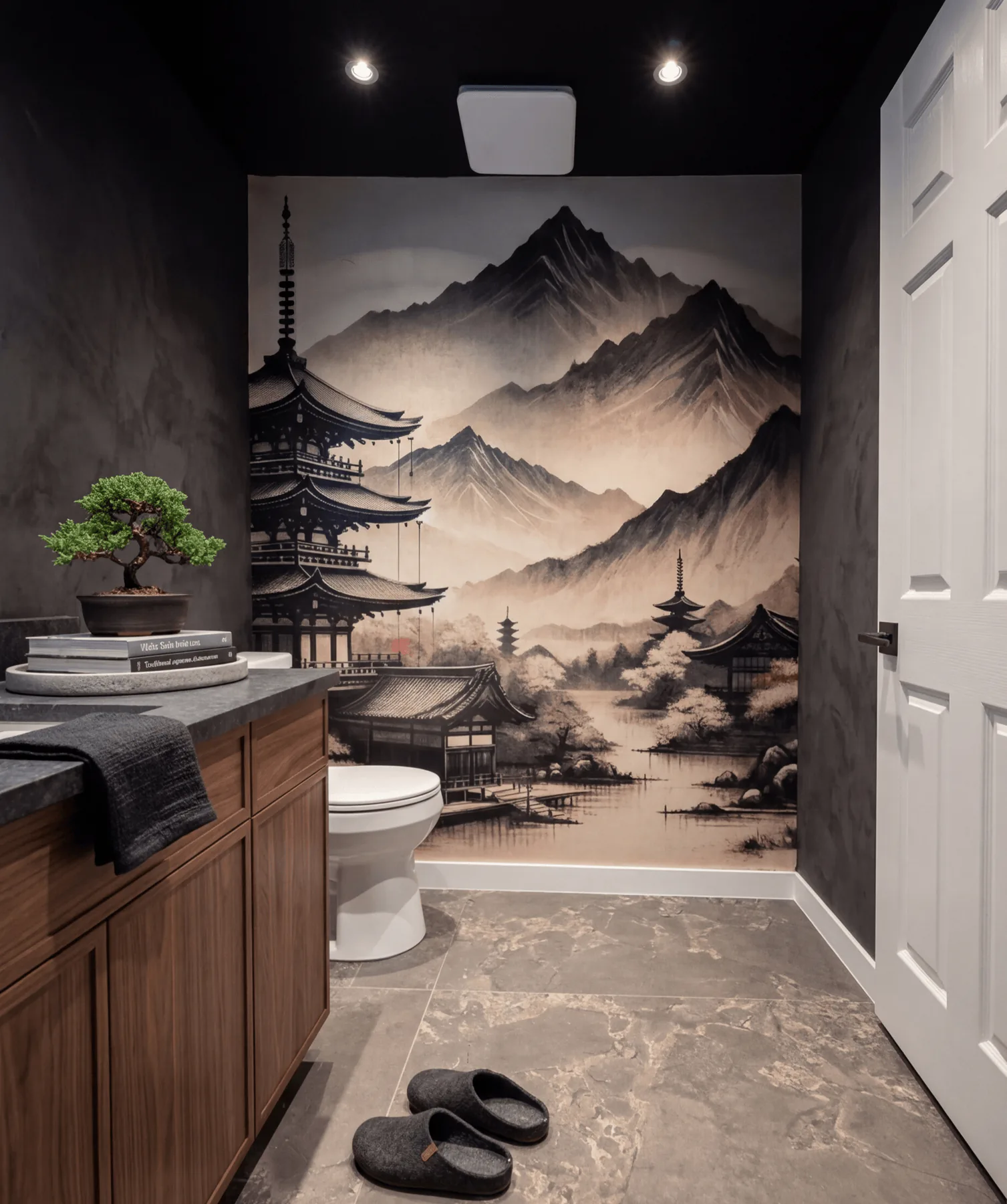
“A small room is often where the boldest idea belongs.”
This powder room commits fully to mood. The mural pulls the eye to the far wall, the black surround closes the room in, and the walnut vanity adds warmth so the drama never turns cold.
The detail to notice is the restraint around the sink wall. The vanity stays clean and linear, which gives the artwork room to carry the emotion. In compact rooms, one strong gesture is usually more powerful than many.
“Water and planting give the frontage its first pause.”
The fountain and raised black planters now carry the first read of the frontage. Water, foliage, and softened edges make the compact entry feel like a garden room before the eye moves toward the steps.
The concrete still keeps movement clear, but it is supporting the composition rather than becoming the story. Planting spills over the planters, the fence filters the street, and the water feature gives the approach a calmer centre of gravity.
“The fence line and planting give the architecture a sharper public face.”
From the curb, IOM arranged the frontage with a centred walk, black fencing, and planting beds that sit low enough to frame the house instead of hiding it.
Grasses and layered foliage soften the stone facade while preserving clear sightlines. The result is stronger curb appeal with privacy built into the edge, not added as an afterthought.
“A focal point works best when the space around it has been composed to hold it.”
This corner shows how the garden shifts from arrival into retreat. The black privacy fence establishes the room, while the statue and fountain give the space a quiet centre of gravity.
Planting softens the walls and the house edge without blurring the circulation. Water, greenery, and concrete remain distinct, so the entrance garden feels calm and usable.
“Raised planters let colour feel deliberate rather than decorative.”
Raised black planter boxes control the planting line along the fence. Hydrangeas, grasses, and dark foliage create depth while the planters keep the composition crisp against the concrete.
The detail matters because this is a close-range view. The planting softens the boundary and adds seasonal colour, but the structure keeps the frontage tailored to the architecture.
“The most private moment of the frontage is still part of the arrival sequence.”
Here the concrete levels broaden the approach and make the entrance garden feel more spacious. The black fence screens the street, while the statue and layered planting create a clear focal point.
The space still reads with the house. Raised planters soften the facade, the open concrete keeps movement easy, and the planting gives the landing atmosphere without crowding the approach.
“The walk from driveway to front door can become a room in its own right.”
Conceived for a lakehouse, this courtyard is planned as a transitional pause space between driveway and front door. Water, stone, and sculpted planting create an inward-facing calm that slows the approach and gives the entry sequence more ceremony.
Just as important, the courtyard is meant to be seen from the architecture around it. Large garage windows already draw the garden into daily routines, and future entrance glazing would deepen that relationship, allowing the landscape to feel embedded in the life of the home rather than set outside it.
“Shelter is what lets an arrival space feel inhabited rather than merely passed through.”
The pavilion gives the courtyard its inhabitable centre. Rather than treating the space as decorative frontage, this concept imagines an outdoor room where one can pause, reset, and take in the garden before crossing the final steps to the door.
Its value is spatial as much as visual. The structure adds vertical rhythm, frames the surrounding planting, and gives the courtyard the kind of sheltered intimacy that makes arrival feel composed rather than abrupt.
“A transition feels more luxurious when the pace has been deliberately slowed.”
This bridge is not only a connector. It changes tempo. Moving across it, one leaves the directness of driveway and pavement for a more measured sequence of water, planting, timber, and filtered light.
That shift in pace is what gives the courtyard its emotional clarity. The space begins to feel immersive, even meditative, because movement has been shaped with the same attention as the planting and architecture around it.
“A courtyard becomes more persuasive when it is composed for both passage and sightline.”
The circular opening turns the courtyard into a deliberate picture plane. Water feature, bridge, and planting are held within one frame, which gives the garden an immediate sense of order and focus.
This matters especially in relation to the house. When viewed through garage windows now, and through future entrance glazing later, the courtyard becomes part of the everyday interior experience rather than a separate exterior scene.
“A larger garden has the opportunity to feel like an escape rather than an extension.”
This concept treats the backyard as a complete outdoor living environment. Bridge crossings, layered planting, water, sculpture, and garden structures are arranged as a sequence of immersive rooms rather than one continuous lawn.
The design ambition is fullness without chaos. Structure provides order, greenery softens the edges, and flowering colour is used to deepen atmosphere, giving the property the feeling of a private retreat held entirely within its boundaries.
“A garden begins to feel inhabited when movement through it has shape.”
The pergola changes the experience of the path immediately. Overhead structure, climbing greenery, and a narrowing view ahead make the walk feel guided, as though the garden is unfolding in stages instead of revealing itself all at once.
That sequence is what turns a larger footprint into a designed retreat. It allows the garden to feel layered and immersive, with moments of enclosure that heighten the openness beyond them.
“A focal piece is not decoration alone. It gives the landscape a centre of gravity.”
Placed within a ring of grasses and layered planting, the pagoda form gives the garden an unmistakable centre of gravity. It allows the surrounding lawn and pathways to feel intentional, not leftover.
Focal elements matter most when the rest of the composition supports them. Here, clipped planting, looser texture, and the open sweep of lawn keep the sculpture calm and grounded rather than theatrical.
“The most convincing garden rooms hold structure, softness, and atmosphere at once.”
This perspective shows the concept at its fullest. Pathways, bridge, water, structure, and layered greenery all work together, so the garden reads as a complete environment rather than a collection of isolated features.
That wholeness is the real goal of the design. The space is meant to feel lush, private, and quietly transportive, offering the sense of escape one associates with a destination property while remaining fully part of daily life at home.
This portfolio is only the beginning. If you have been waiting for the right designer to shape your kitchen, cabinetry, or full-home vision, we would love to make your project the next story added here.
Book a ConsultJoin our list for the occasional note from the new showroom in downtown Camrose: thoughtful launches, quiet invitations, and your complimentary Dream Home Consultation whenever you are ready.
Your information stays with our studio. We don’t share, sell, or spam.
Your welcome note is on its way.
In the meantime, your complimentary
Dream Home Consultation is ready below.